Author Archives: lea

Lea effectively teaches online courses

Color & Composition 1

My newest online class begins June 22

Learn more about C&C 1

This 6-month Color & Composition 1 course, runs June-November 2024.
Online meetings held the 4th Saturday of each month(US time zones: ET 1-3, CT 12-2, MT 11-2, PT 10-12)

Each session includes:

-an in-depth look at a color concept, color scheme, and a composition concept
-suggestions for application of concepts in your work
-ideas for all styles of quilting: modern, art, traditional
-lively conversation and sharing of work and ideas
-access to session recordings for catch up and review

Something for Everyone

Lea helps studentMy goal is present enough new content, information, tools, and ideas that everyone, no matter
what you already know, will leave with something new that you can use to enrich your creative experience , or take your art to the next level. Each Color & Composition 1 live session will be recorded so that you can catch up if you miss the online meeting.  Recordings will be available for one month so that you can rewatch a session to refresh and review the information.

Access through Your Learning Style

I know that not everyone learns in the same way. So, in addition to the live presentation, each session includes a study guide for those who like to take notes and review the written word. I will give suggestions for follow-on projects to satisfy our tactile/kinesthetic needs. Each session if full of useful information, and you will be able to see it, hear it, touch it, and use it.

Learn & Apply

At the end of each session, participants are invited to create something new and original based on the information experimenting with design blocks presented in each Color & Composition 1 lesson. This could be something simple that uses one of the concepts presented, or something more complex, with multiple concepts applied.  We will begin sessions 2-6 with show & tell time where we learn from each other and celebrate creative efforts.

If you have questions, please reach out and email me at: Lea@LeaMcComas.com

If you are ready to sign up, follow this link:

Sign me up for Color & Composition 1

Share
Close up of finish Close Encounter panel 2., artwork by Lea McComas

New Work: Chance Encounter

This new work is based on a chance encounter between a mountain lion and my husband at the end of our driveway. Today I’m sharing a bit about my design process and the tools I use in creating a composition. If you want to learn more about my process, stay tuned to future blog posts, and sign up for my Color & Composition class. 

Inspiration

This new work is based on a chance encounter between a mountain lion and my husband, Jim. It took place at the end of our driveway. Luckily, Jim was in a vehicle where he could snap a few photos. Here are the ones I chose for the Chance Encounter series.

Editing the Images

I initially decided that I would capture the chance encounter with a series of 4 panels. Photoshop Elements, I cropped and resized the images then used the grayscale and posterize features to create images that I could print on paper and create my patterns.

In the crop and resize phase, I kept 2 goals in mind. First, each panel would increase in width as the lion slowly exposed more of himself before coming into full view. It was important to have an element that was consistent throughout to support the idea that the viewer was looking at the same place with expanding vision. The large rock was that element. I cropped to place it along the left edge of the first 3 photos photo, and extended the right edge as the panels increased. The fourth photo did not include the rock, but I plan to add that feature into panel 4.

Here are a couple of the cropped images:


Using the Golden Ratio for Balance & Consistency

Second, I sought to apply the golden ratio (1:1.618) to create balance and consistency. It was the basis for determining the dimensions of each panel. ALERT: I’m about to take you through my math calculations. I hope you enjoy the process as much as I do. After deciding the series would be 30 inches tall, so I used my golden mean calipers to divide that distance into 2 smaller measures: 11 1/2″ and 18 1/2″. These are the widths panels 1and 2. Then, it was a matter of multiplying 18 1/2 x 1.618 to get 30, the width of panel 3. I repeated the process (30 x 1.618= 48) to get the width of panel 4. In this way, the increasing widths follow a pattern that is pleasing to the eye.

Using the Golden Ratio for Placement of Elements

Another application of the golden ratio was in the placement of elements within each composition. For this explanation, I’m going to convert the golden ratio to a pair of fractions: 3/8 and 5/8. In my photo editing software, when using the crop tool, a grid appears over the image, dividing it into exact thirds vertically and horizontally. It looks like a tic-tac-toe grid, and is a guide for using the Rule of Thirds in creating a composition. This is a simplified vers

ion of the golden ratio. However, I’m a bit of a purist when it comes to the golden ratio, so I visualize the lines a little closer, creating a center section that is slightly narrower than the outer sections. I then crop to try to place key elements along these lines, and at the points of intersection. Here is what it looked like with panel 1. Note the top of the rock, and the eyes of the lion.

The important thing in this phase was to create a series of compositions where each was an extension of the previous. Eventually, I decided that the first 3 panels could hang together and tell the story in a reasonable space. Including the 4th panel, 48 inches wide, would have increased the overall width of the Close Encounter series to 108 inches, plus space between the panels. It was just too much. Really, where would I hope to hang the series so it could be viewed in its entirety? This chance encounter was beginning to feel like a long, drawn out encounter. Besides, the 4th image wasn’t essential to the story as the lion running off was implied in the 3rd panel.

Grayscale

Next, I convert each image to grayscale mode so that I can impose my own color scheme (more on that in a future post). Sometimes, elements of similar value begin to blend together, so I use the pencil tool to draw in important lines that have disappeared. In this case, I needed to outline the mountain lion to keep him separate from the rock and the foliage. Because they were darker values, I used a white line. However, sometimes, a black line is more effective.


Posterize

Finally, I posterize each image. I like to work with 5 values in the key figures, in this case, the mountain lion. With the very light snow background, and the very dark sticks and branches, the lion is largely mid-values. This means that I have to posterize the images at 7-8 values to get 5 values in the lion. When I refer to value levels, 1 is always the lightest value, or white. Levels get progressively darker as the number increases. The number assigned to the darkest value, black changes. For example, If I’m working in 5 values, then 5 is black. However, if I’m working in 8 values, then 8 is black. In the image below, there are 8 values, but the face of the lion appears in values 3-7.

Later, when I’m choosing fabrics for the lion, I’ll be able to expand the range of these “face” values to give the lion more depth and dimension, and enhance him as a focal point. Look for that in a future post.

Color & Composition Course

Also, consider joining my Color & Composition class. This class will run for 6 months with a monthly online meeting where we take an in-depth look at a color scheme, color concept, and a composition concept. Participants are encouraged to go out and use the information in their own work, and bring their progress back to share with the group in the next monthly meeting. to help you in your original design Here is a link for more information:

Color & Composition I


Share

Introduction to Thread Painting Course begins April 1.

Excitement is building as the start date for my new online class is fast approaching. Introduction to Thread Painting begins April 1. That’s next week and there are still a few spaces available.

Additionally, in the coming months, I will begin Color & Composition courses, and will offer Coaching Sessions, along with free behind the scenes content for all to enjoy.

I feel strongly that connection is essential to successful learning, and hope to build a vibrant, sharing community where creators feel emboldened to learn and apply new skills and concepts. If this appeals to you, read on to find more details about each of my offerings…


Introduction to Thread Painting will begin April 1.

-Course includes 12 lessons that increase in difficulty and complexity to help you build yourstitching skills.

-Each lesson includes an instructional video, lesson notes, support materials, and ideas for further exploration.

Because I believe face-to-face contact is so important to learning: All participants are invited to join a weekly video check-in with Lea on Wednesday evening, or Saturday afternoon.

-A new lesson becomes available each Monday for 12 weeks, with an additional 4 weeks access to all course materials.

-The cost of the course for Beta testers is $180. That is just $15/lesson

To learn more CLICK HERE

Color & Composition courses-Coming soon!

-Learn to use color with confidence by gaining an understanding of color theory and elements of composition. 

-There is so much information to cover on these topics that it will be divided into 2 courses. Color & Composition I will be available in June 2024, and Color & Composition II be offered in January 2025.

-Each class meets for a 2-hour online video session once a month for 6 months. 

-Each session features an in-depth look at a color scheme, a concept related to color, and another related to composition, along with ideas for further creative exploration.  

-Participants will respond to monthly challenges and share their work at the next meeting where we will celebrate and give feedback as requested.

-This is meant to be a very nurturing experience that provides inspiration and encouragement, while celebrating experimentation and artistic exploration.

To learn more about this, and other upcoming courses and offerings, CLICK HERE

Individual and Group Coaching Sessions available in the coming months.

-This is an opportunity to talk through iussues or obstacles encountered inyour creative process related to color, design, composition, or execution.

-Advice and guidance is also available related to submitting to competitions and exhibitions, publishing, and teaching about your work.

-Sessions are offered for 30 or 60 minutes via video conferencing.

-These are single session events, so no long tern commitment.

-Sessions are suitable for individuals, or a small group working on a single project.


If you want more information on Coaching Sessions, CLICK HERE to add your name to the waitlist, and you’ll receive notice and more details as they become available.

Share

Sandra Day O’Connor: 1st Female Supreme Court Justice

Full vioew of the Women's Work quilt

Celebrating women’s struggle for equality and the right to vote.

Sandra Day O’Connor (1930- 2023) the first female U.S. Supreme Court justice.

Justice O’Connor is one of the 57 women featured on my Women’s Work quilt. She is shown breaking the glass ceiling with her gavel. 

Humble Beginnings

Justice O'Connor breaking the glass ceiling with her gavel

Justice O’Connor breaks the glass ceiling with her gavel.

Sandra Day was born in El Paso, Texas. Growing up on a large cattle ranch, miles from the nearest paved road, with no running water or electricity, she learned to be resourceful and self-reliant. Despite these challenges, Sandra was an excellent student and was accepted into Stanford University at age 16. She graduated magna cum laude with a degree in economics in 1950 and a law degree in 1952. She also served on the Stanford Law Review under editor-in-chief and future Supreme Court Chief Justice William Rehnquist. They dated briefly and Rehnquist proposed marriage. Instead, Sandra married fellow law student, John Jay O’Connor III.

After graduation, the O’Connors settled in California where, despite her academic achievements, Sandra was unable to find work. No firm would hire a female attorney. Eventually, she worked in San Mateo as a deputy county attorney where she shared office space with a secretary and worked for no salary. When her husband was drafted and sent to Germany in 1954, she accompanied him. There, she served as a civilian attorney for the Army Quartermaster Corps.

In 1957, the couple moved to Arizona, and Sandra took a break from practicing law to raise three sons. She was active in several political organizations and became the state’s attorney general. Later, she served in the state Senate, gaining power in this position to become the majority leader in 1973, the first female to hold this position in any state legislature.

Climbing the Judicial Ladder

In 1979, Sandra returned to the courtroom as a superior court judge and worked her way up to the Arizona State Court of Appeals. Two years later, Ronald Reagan appointed her as the first female Supreme Court justice. Her confirmation hearing was the first televised for a Supreme Court justice. After three days, the US Senate unanimously confirmed her appointment. As the first female Supreme Court justice, O’Connor understood the importance of proving that a woman could do the job well. She was known for meticulous research, practical decision-making, and building collegiality. She initiated the practice that all justices eat lunch together, a custom that continues today. There were some very practical challenges for the first female justice: at the time of her appointment, there was no women’s restroom near the courtroom.

Throughout her career, Justice O’Connor’s faced praise and criticism for her decisions. Most notably, she ruled against gerrymandering in a case where lines were clearly drawn based on race. She refused to overturn Roe vs. Wade but did decide favorably in many cases that limited access to abortion. Her most controversial decision involved the presidential election of 2000 in Bush vs. Gore. She was the swing vote that stopped the recount of votes in Florida, thus giving the election to George W. Bush. Years later, she expressed her regrets that the court had agreed to hear the case.

Retired, but Active

Justice O’Connor retired in 2005, but remained outspoken about the need for an independent judiciary functioning as a check on other branches of government rather than a legislative tool used by political parties. She founded the O’Connor Institute to promote democracy through civil debate, problem solving through consensus, and participation of all citizens in the democratic process.

Learn about more amazing women

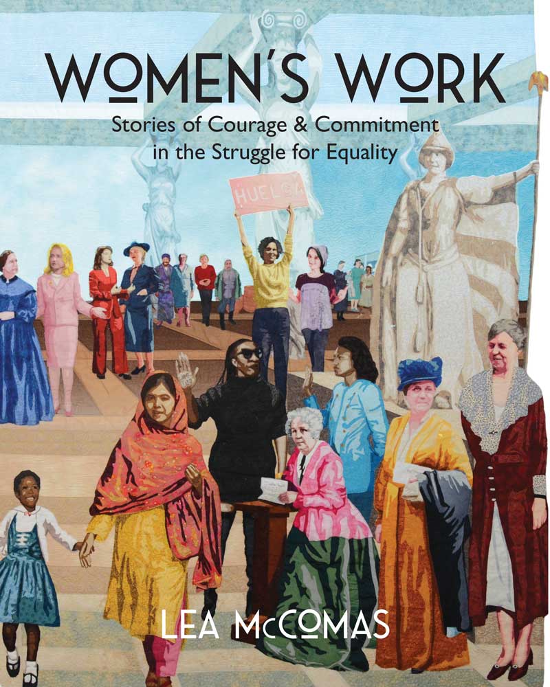
Cover of book, Women's Work shows partial view of the quilt.

Women’s Work: Stories of Courage & Commitment in the Struggle for Equality

Women’s Work, the book, tells the stories of all of the amazing women featured on the Women’s Work quilt. 

$35 

Share

Play Date with Color & Composition

My success in creating award-winning fiber art, is due, in large part, to my continual search for

The Long Goodbye, ©2019, 

new knowledge and understanding of how art works; specifically understanding how colors and elements of a composition interact, or play together.  Many years ago, I began taking breaks from my “serious work” to just play with the scraps and leftovers. These play dates with color & composition provided a low-stress, no-cost opportunity to experiment, while engaging in the hands-on type of activity where I learn best.

Scrap Collages

Early on, I simply created small collages using leftover, fusible-back scraps from my applique portraits.  I just played with the scraps, not giving a great deal of thought to color or composition–working intuitively.

My success was mixed; some compositions were pleasing, and others were–well, a mess.

Because I really wanted to understand how I achieved success so that I could spend less time making crap, I became more disciplined in the process. I began to think of these exercises as science experiments with dependent and independent variables.

I asked questions like,

  • If I keep the colors the same, but alter the values of the various elements, how does that effect the overall composition?
  • How does the placement of various elements effect the balance of the composition? 
  • What combinations draw the viewer in? Send the viewer away?

Monochrome Tessellations

First, I started simple, working monochromatic and playing with symmetry and tessellation.


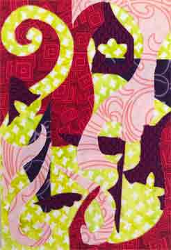
For the unfamiliar, here is a quick tessellation activity:  Using a scrap of rectangular fabric, cut a chunk, or shape out of 1 side and rotate it as I did above. Another option is to cut shapes from 2 adjacent sides and slide those shapes across to the opposite side as I did below.

These early attempts were quite simple. However, below are more complex monochromatic samples that I put together later. Still, each new iteration conjures more ideas.

(For more information on how light and dark values play together, visit my previous post on positive and negative space.)

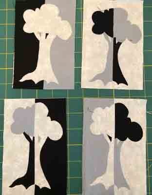
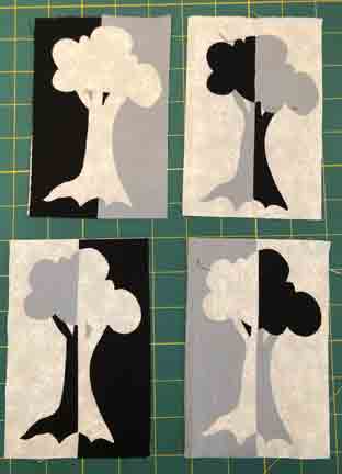
tree drawing is used to create various versions of a 3-value notan

Mirror image tree composition created with 3-values.

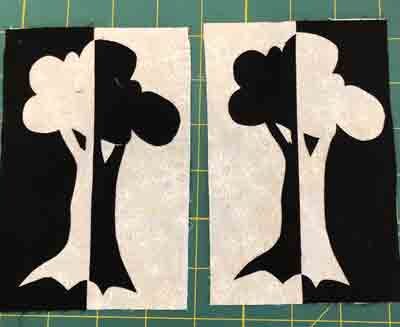
Mirror image tree with 2-value notan.

Mirror image tree with 2-values.

I could have traveled down this rabbit hole indefinitely, but I didn’t.  In future play dates, I engaged with more complex color & composition schemes.  Next, I’ll share my explorations with complementary colors and radial design.

Play Date with Color & Composition Workshops

In time, these play sessions became the basis for a new workshop where I take participants through 6 color schemes and 6 composition schemes in a few short hours. Now, there are multiple opportunities to take this workshop. It is fast paced and fun, and everyone goes home with original works of art.

Let’s get together and work through this process in person. Please join me in one of my upcoming workshops. Below are the places, dates, and links to register.

Stitch Fest – Loveland, CO, April 13
Intro to Thread Painting, 9:00 AM-4:30 PM
Play Date with Color & Composition, 6:000-9:00 PM
 
 
Stitch Fest – Milwaukee, WI, May 25
Intro to Thread Painting, 9:00 AM-4:30 PM
Play Date with Color & Composition, 6:000-9:00 PM


Kansas City Regional Quilt Fest, June 14-17.
I’m teaching a variety of workshops every day.  Follow this link to see what is available.


Share
3 possible ways to create a color scheme with 5 colors

How to Create a Color Scheme That Works

A balanced color scheme is a key component of a successful art quilt, or any other artistic endeavor. I have a method to create a solid scheme, identify a missing color, or fix a scheme that doesn’t work. I discussed this topic in my most recent Color & Composition class and share a summary of that information here.  If you are intrigued,  information about future Color & Composition class sessions can be found at the bottom of this article.

Create a Color Scheme with Reflective Symmmetry

The color wheel is an essential tool in this process.  Most come with features that prompt various color schemes using triangle, rectangle, or square shapes.

close up of 2 color wheels showing color scheme guides

Color scheme guides on color wheels

A common feature of each of these shapes is that they have reflective symmetry; also referred to as bi-lateral symmetry.  This means that you could draw a line through the shape so that one side is the exact reflection of the other.  You could fold that image on the line and have both halves match exactly.

Triangle, rectangle, and square shapes with line of symmetry.

Shapes with Reflective Symmetry

Create a More Colorful Scheme

It is possible to stretch beyond the standard color schemes, and still maintain harmony and balance. The key is to use colors that create a shape with reflective symmetry.  For example, when using 5 colors, think of a simple house shape.  Make your dominant color the peak of the roof.  The next 2 colors will be the corners where the roof turns into walls, and the final 2 colors will be the base of your walls.

3 possible ways to create a color scheme with 5 colors

Variations of a 5-color scheme

The colors may not be evenly spaced, but, if the guiding shape has reflective symmetry, you will create a scheme that has harmony and balance.

Complete, or Fix, a Faulty Color Scheme

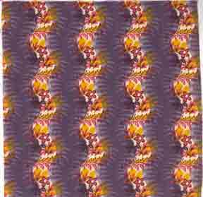
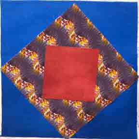
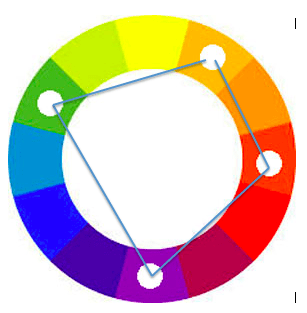
Maybe you have a set of colors that are must-haves in your quilt project, but you want to be sure that the overall scheme is solid.  In my example below, I’m starting with an ugly fabric that has sentimental meaning.  To begin, I place markers on the color wheel to indicate the colors in this fabric. In this case my colors are violet, red-orange, yellow-orange, and these do not create a shape with reflective symmetry.

color wheel shows unbalanced scheme of yellow-orange, red-orange and violet

ugly fabric color scheme is asymmetrical

Ugly fabric with undulating purple stripes alternated with curved stripes of gold and red flowered vines.

Ugly fabric


Add a fourth color to create a color scheme that has balance and harmony.  Here are 2 possible options.  First, adding blue to the scheme will balance it.


create a balanced color scheme by adding blue to create a trapezoid.

Add blue to create a trapezoid.


fabric swatches show color scheme that adds blue to the ugly fabric

Fabric Swatches show blue in the mix.

Replace blue with green to create another balanced color scheme.

create a balance color scheme by adding green to the mix

Option 2: add green to the scheme

fabric swatches show green with ugly fabric

Add green to the mix.

Make the scheme more complex by adding both blue and green.  This will also create a pentagon shape on the color wheel; and a shape with reflective symmetry.

balanced color scheme with blue, green, violet, red-orange, and yellow-orange.

Balanced Scheme with 5 colors.

create 5-color scheme by adding blue and green to the ugly fabric

5-color scheme that is balanced

Learn More in My Color & Composition Class

Interested in learning more? Every month I lead a Color and Composition class where we explore a color scheme, color concept, and a composition concept.  We meet online  the 4th Saturday of every month 1:00-3:00 PM MDT. To join us, sign up through the Rocky Mountain Quilt Museum.

Subscribe to this blog for future summary updates on topics covered in the Color & Composition class.

Share
Use calipers to measure sashing and first border.

Quilt Borders and Sashing Using the Golden Mean

The Golden Mean and Calipers

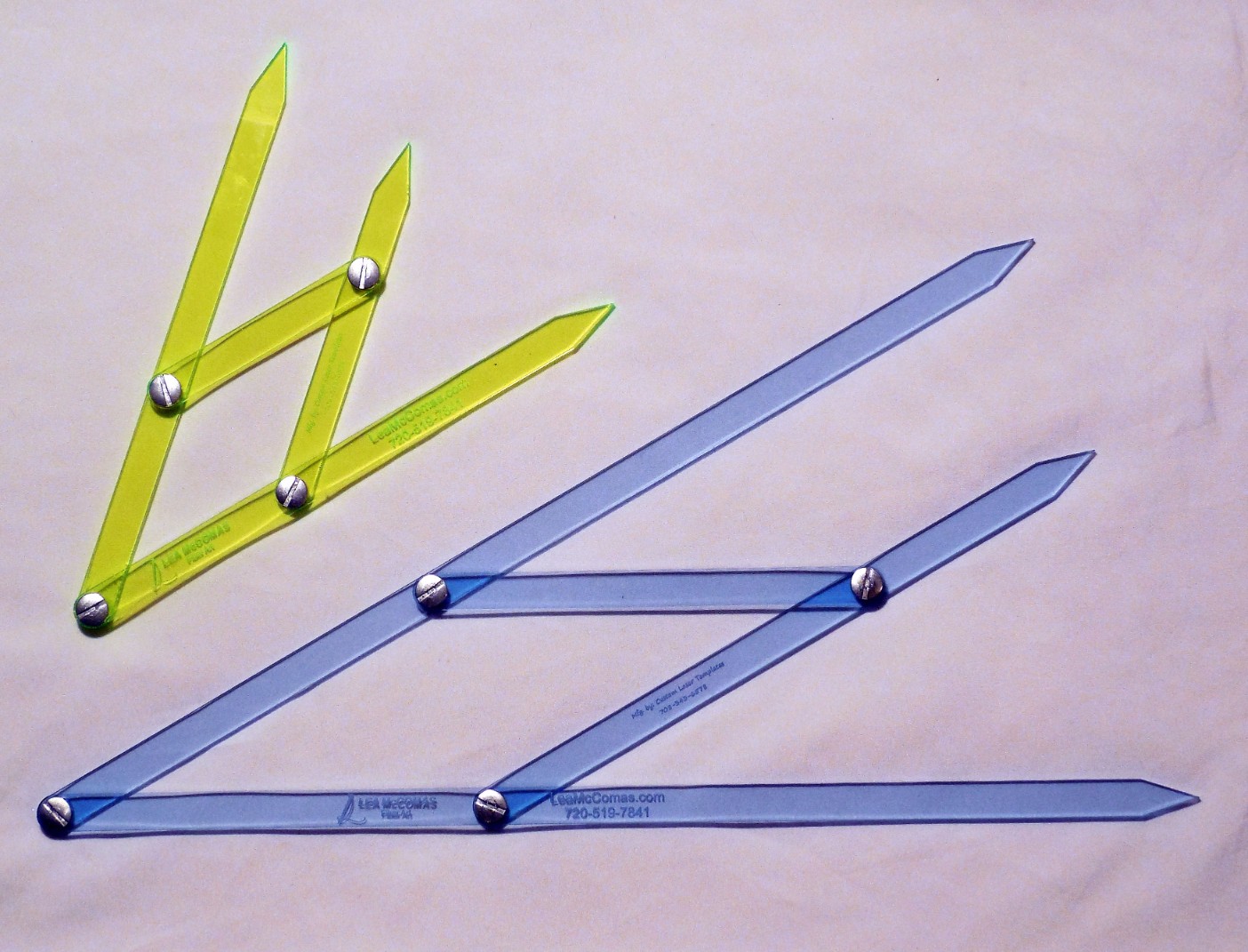
Finding the perfect width for your quilt’s borders and sashing is easy if you use the Golden Mean.  If you aren’t familiar with this term, it refers to a sweet spot in the middle, between 2 extremes.  It divides a space so that one side is a bit larger than the other in a way that is harmonious and pleasing to the eye.  Also referred to as the golden ratio, it occurs often in nature.  To find this division of space, I love to use my Golden Mean Calipers.  As the calipers open and close, the center point, always indicates the Golden Mean, and two harmonious inner spaces.  

large and small Golden Mean Calipers

large and small Golden Mean Calipers

These calipers are available in the Creativity Tools section of my web store.

Perfect Borders Using the Golden Mean

Adjust the Golden Mean Calipers to measure the width of a quilt block

Measure the width of your block.

This tool is also useful when adding borders to a traditional block quilt.  One method is to start with the blocks themselves.  Place the outer points of the calipers at the edges of the blocks.  This will give you two new measurements that will be in harmony with the blocks. 

Use the larger measurement for the total width of the border. 

Use the larger of the 2 inner golden mean measurements for the finished width of the full border.

Create a single border matching the wider measurement of the calipers.

Divide this area further by placing the outer points of the calipers on the edges of the border area.  This will indicate pleasing widths for an inner and outer border. 

Divide the border area using the calipers.

The golden mean indicates the optimum width of borders and sashing.

Create harmonious smaller borders.

All measurements indicate finished sizes, so don’t forget to add seam allowances.

Perfect Sashing Using the Golden Mean

Use the golden mean to determine the width of sashing, as well as borders.  The smaller inner border width, determined above, is also the perfect width for sashing.  Sashing is used  between and around all of the blocks, and it serves to set the blocks apart for the purpose of highlighting each as an individual unit.

Borders surround the grid of blocks and visually hold them together.  Sashing adds to the visual weight of the grid layout, and creates the need for a larger border to maintain balance. Combine the width of the sashing and the single border to create a harmonious, larger, outer border, as shown below.

Use golden mean calipers to measure sashing and first border.

Measure sashing & border

Golden Mean Calipers indicate width of an additional border

Calipers indicate width of additional border

Borders and Sashing for a Predetermined Quilt Size

Sometimes, a specific finished size is necessary and the process described above will exceed those limits.  In this case,  if you know how wide the full border needs to be, but you want to break it down into multiple borders, the golden mean is a good way to do that.  Open the calipers to the full border width, and use the two inner measurements for multiple border widths.

No calipers – No Problem

You can also determine harmonious measurements without the calipers by using the magic number: 1.6.  Take any measurement.  Determine a larger size by multiplying by 1.6

Example: 5 x 1.6 = 8 

Conversely, divide by 1.6 to find a smaller measurement.

Example: 5 ÷ 1.6 = 3.125 (Round down to 3 inches)

Learn More in My Color & Composition Class

Interested in learning more? Every month I lead a Color and Composition class where we explore a color scheme, color concept, and a composition concept.  We meet online  the 4th Saturday of every month 1:00-3:00 PM MDT. To join us, sign up through the Rocky Mountain Quilt Museum.

Subscribe to this blog for future summary updates on topics covered in the Color & Composition class.

Share
Malala shown walking forward wearing a golden kaftan with a red scarf.

Malala Does the Women’s Work of Educating Girls

Malala Yousafzai appears on the Women’s Work quilt for her efforts in educating girls.  Find her at the center front of the quilt, walking hand in had with a young Ruby Bridges. Together, they represent the long struggle to provide education to those denied based on race, gender, or ethnicity.

Educating Girls: a Family Priority

Malala Yousafzai was born on July 12, 1997, in Mingora, a town in the Swat Valley of northwest Pakistan.  Her father, Ziauddin Yousafzai, and mother, Tor Pekai Yousafzai were Sunni Muslims. They named their first child, Malala, after a famous female, Afghan warrior. Malala’s parents vowed to provide their daughter with the same opportunities traditionally allowed only to sons. 

photo of the girls attending the Yousafzai school for girls. Her father, center back placed a high vale on educating girls.

Yousafzai school for girls

Malala’s  father and grandfather were educators, and her parents valued education for all children.  They owned and ran several private schools, some for boys, and others for girls.  Malala’s father recognized early on that his daughter had an exceptional mind.  He sought to grow her curiosity, and would allow her to stay up after her younger brothers went to bed.  They talked about politics and other important issues of the day.

Taliban Outlaws Educating Girls

The Taliban, an Islamic fundamentalist group, took control of the Swat Valley in 2007.  They

School destroyed by the Taliban

School destroyed by the Taliban

sought to impose Sharia law, a very strict interpretation of the religious principles put forth in the Quran, and they imposed harsh and extreme punishments. This included bans on many forms of entertainment, including radio and television. The Taliban forbade men to trim their beards, and they executed, or amputated the hands of barbers who performed this service.  The Taliban beheaded their opponents and put the bodies on public display. They also banned the education of women and girls.

In January 2008, the Taliban shut down schools for girls and destroyed many of the buildings.

Malala gave her first public speech asserting the importance of educating girls in September of 2008 when she was only 10 years old. Speaking before a regional gathering of newspaper and television journalists, she declared, “How dare the Taliban take away my basic right to education?” She was young, but her work as an activist had begun.

Fierce Educational Activists

Malala’s father was an activist with a strong belief in finding peaceful solutions. He encouraged her to become involved in organizations that promoted educational instruction, encouraged public debate, and journalistic freedom related to social issues.  She remained a vocal critic of the ban on education for girls. At age 11, she connected with the BBC and began a blog that described life for ordinary people under the harsh rule of the Taliban.  To protect her, this work was published under the pseudonym “Gul Makai,” the name of a heroine of a Pashtun folktale. She and her family could have been killed if her true identity was known.

Malala’s blog ended suddenly in March 2009 when her family was forced to flee the region. Her father spoke out against the Taliban, and in response, they broadcasted death threats to her father over the radio.  The family returned to their home later that year, after the Pakistani military was able to push the Taliban from the cities and regain some control of the region.

Attempted Murder

Malala continued to advocate for educating girls through her associations with a number of child advocacy, and female empowerment organizations, and gained international recognition for her work. Archbishop Desmond Tutu nominated her for the International Children’s Peace Prize.  Finally, in 2012, Taliban leaders, offended by her words and actions, decided that she needed to be silenced.  On October 9, 2012, a masked gunman boarded her school bus, shot Malala in the head, and then disappeared into a crowd.

International Outrage and Support

The event shocked the world and prompted international outrage. Protesters took to the streets in many

Malala with her Nobel Peace prize

Malala with her Nobel Peace prize

Pakistani cities.  Celebrities, government leaders,, human rights and women’s groups, from around the world issued scathing rebukes of the attackers.  Fifty Muslim clerics in Pakistan issued a fatwa against the men who had organized the attempted assassination. 

In response to this, the Taliban released a statement naming Malala a “symbol of the infidels and obscenity” and vowing that, if she survived, they would target her again.

Although seriously injured, Malala did not die. Doctors treated her locally, before transferring her to Germany, and then to the United Kingdom where she received treatment in Birmingham England. She underwent multiple surgeries and intensive physical therapy over the next two years. Eventually, her family also relocated to England for their safety. 

Malala Becomes the Educated Woman

 Malala could have recovered and faded into relative obscurity, but instead, she chose to continue her campaign for the education of girls. She co-founded the Malala Fund, an organization dedicated to ensuring that girls around the world have an opportunity to learn and become leaders.  For her work, she received the Nobel Peace Prize in 2014. At age 17, she became the youngest recipient of this award.  Malala completed high school in England and went on to study at Oxford.  She completed a Bachelor of Arts degree in Philosophy, Politics, and Economics in June 2020.  It is not safe for her to return to her home country of Pakistan. There are still many Taliban supporters and sympathizers that would seek to harm her. Now, she has become a citizen of the world. 

Malala Fund for Educating Girls

For Malala, educating girls continues to be a priority.  The Malala Fund supports education advocates and activists who are challenging the policies and practices that prevent girls from going to school in their communities.  Some examples of their work:

-They are using technology to give Syrian refugee girls access to classrooms they are not allowed to physically attend.  They are also working to reduce child marriage. 

-In Nigeria they are helping girls living under the threat of Boko Haram complete their education. 

-In Brazil, they are ensuring schools reach the most marginalized girls.  And they are training young women to speak out for their rights. 

-In Pakistan, they continue to fight for education funding that will guarantee 12 years of school for girls.

My Personal Take Away…

Portrait of Malala wearing a red scarf. Negative space is created with a white background. A Islamic floral border of blue and red flowers with green leaves. The center text is a quote by Malala Yousafzai, "With guns you can kill terrorists, with education you can kill terrorism.

Malala, by Lea McComas, 30″ x 50″, 2019.

I’ve been a teacher for almost 40 years, and I know firsthand the power of education.  I love how the actions of the men who sought to silence Malala, actually, amplified her voice so that she could be heard around the world.  I celebrate Malala for standing up to her oppressors, and for the journey she has taken since that fateful day on the bus.  In 2019 I was invited to make a quilt for the Better World quilt exhibit celebrating heroes working for the greater good.  I chose Malala as the subject of my quilt and included one of my favorite Malala quotes, “With guns you kill terrorists, with education you kill terrorism.”

You can be a part of this important global movement for women’s equality. Please visit Malala.org to see how you can be involved.

See the Women’s Work Quilt

 The Women’s Work Quilt will debut as a featured work in the exhibit Women’s Voices, Women’s Votes, Women’s Rights, at the Clinton Presidential Library, in September 2021.  Look for more details on the Events page of this website.

Share

How Subjective Timbre Relates to Color Theory

In my most recent Color & Composition class, our study of color theory took us to the topic of Subjective Timbre.  This is a topic not often covered in discussions of color theory.  Read on for a summary of that part of the discussion.  If you are intrigued,  information about future Color & Composition class sessions can be found at the bottom of this article.

Subjective refers to anything based on the individual (i.e. feelings, opinions, reactions)

Timbre refers to the character of a sound or, in this case, color.

Therefore, subjective timbre refers to our personal responses to, and interpretations of various colors.

Before you read further, take a moment and look around you for a favorite colorful object, or article of clothing.  If possible, have it handy for future reference.

Itten Color Theory and Seasonal Palettes

 Johannes Itten, in his color theory, color system, divided colors into 4 palettes based on the seasons.  He did color studies and presented them to people and found that, universally, everyone could correctly name the season being represented. Try it yourself.  Below are four of seasonal paintings by Itten. Can you guess the season that each represent?  You can find the answer key at the bottom of this blog. Also, make note of the color study that you find most appealing.

1.Itten color theory: Winter color palette

2.Itten color theory: Summer color palette

3.Itten color theory: Autumn color palette

4.Itten color theory: Spring color palette


4 Ways Subjective Timbre Affects Your Relationship with Color

Itten observed that people had varying reactions to the color palettes.  This prompted a series of experiments with his students.  In the end, he came to several conclusions related to Subjective Timbre.

1.  Everyone has an affinity for one of these palettes over the others.

Which seasonal palette do you prefer?  Now, take a look at your favorite object.  Does it reflect this same color palette?

One of my favorite objects is this carpet that I purchased while living and teaching in Turkey.

My preference for an autumn color palette is reflected in my favorite rug.

Lea’s favorite rug from Turkey

2. Based on personal coloring (skin tone, hair color, eye color) a person will look better when standing next to one of these color palettes.  Here are photos of me standing in front of 2 pieces of art that I created.  One of these pieces reflects my personal color palette. Can you guess which seasonal palette I prefer?


Artists look better standing in front of works done in their preferred seasonal palette.

Lea in front of Crossing Over. Autumn palette.

Artists don't look good standing in front of a palette that doesn't match their personal coloring.

Lea in front of Puppy Love. Spring palette.


Itten’s work on subjective timbre  became the basis for personal color analysis applied to makeup and wardrobe selection (ie: Color Me Beautiful), and interior design.Think about your favorite outfits, or articles of clothing.  What seasonal palette is reflected in your favorite wardrobe choices?.

3. A person’s preferred color palette, the one they are naturally drawn to, is the same palette that is consistent with their skin tone, hair, and eyes or their personal coloring.  

Are you noticing a pattern here?  Are the colors of your favorite clothes consistent with your preferred color palette?

4.  Finally, as artists, we do our best work when we are using our preferred palette.

Apply Subjective Timbre to Your Color Choices

Understanding subjective timbre and your personal color preferences can be helpful in your own creative journey. Think about your best artistic works.  Are they done in your preferred palette?  Also, consider pieces that you have created, and hated.  Is it possible that the color palette is a factor?

I found that this is true for me.  My preferred palette is autumn.  Visit my Portrait and Genre galleries to see how this plays out in my work.  You may notice that I occasionally stray from my preferred scheme.  Depending on your preferences, you may find this pleasing, or not.

When seeking advice from others related to color, be aware that they are likely to respond based on their own subjective timbre. Likewise, when creating a piece of art for someone else, be considerate of their subjective timbre.  

The point of this article isn’t to say that you always need to work in your preferred color palette, but rather, understanding subjective timbre can help you be more successful when working outside of your natural comfort zone.

Blame it on Subjective Timbre

Have you ever . . .

…attempted a guild challenge to use a specific fabric or color scheme with unfavorable results?

…attempted a new work of art based on the identified “color of the year” and struggled to make a composition work?

…seen work by an acclaimed artist and thought, “I know it should be working for me, but it just isn’t.”

…received an article of clothing as a gift from a dear friend, or relative that you deem hideous.? They saw it, loved it, believe it is beautiful, but you won’t be caught dead wearing it.

Understanding your personal relationship with color helps to make sense of all of these situations.

Learn More in My Color & Composition Class

Interested in learning more? Every month I lead a Color and Composition class where we explore a color scheme, color concept, and a composition concept.  We meet online  the 4th Saturday of every month 1:00-3:00 PM MDT. To join us, sign up through the Rocky Mountain Quilt Museum.

Subscribe to this blog for future summary updates on topics covered in the Color & Composition class.


ANSWERS to Seasonal Paintings

  1. Winter, 2. Summer, 3. Autumn, 4. Spring.

My color palette: Autumn


Share
Composition in 2-value notan.

Positive and Negative Space in Art Quilting

Effectively using positive and negative space is key to creating compelling art quilt compositions.

Positive space is the area of the composition that is happening, or of interest

Negative space is the area around the positive space, and the area that is NOT happening, often referred to as “The Resting Space”

You can’t have one without the other, and both serve attention.

Manage Positive & Negative Space in Art

Negative space doesn’t have to be boring to be effective. It is possible to focus the eye and draw attention to the positive space, but not waste the negative space.

In my portrait quilts, I often create the figure, then audition it on several backgrounds to see what works best.  White space worked well for my tribute to Malala, but something with more color and visual texture was needed to offset the solid mass of the figure in Busy Signal.

Portrait of Malala wearing a red scarf. Negative space is created with a white background. A Islamic floral border of blue and red flowers with green leaves. The center text is a quote by Malala Yousafzai, "With guns you can kill terrorists, with education you can kill terrorism.

Malala, by Lea McComas, 30″ x 50″, 2019.

Mottled and textural print fills the negative space to contrast with the bold figure irepresented with solid spaces.

Busy Signal, 25 in x 36
2017.

Auditions for Negative Space

Selecting appropriate fabric for negative space in your art is a skill that can be practiced in isolation. As with any skill: repetition builds proficiency.  I suggest you do the following exercise in a deliberate and thoughtful manner.  This experience will increase your knowledge base and make the process easier in the future.  

  1. Select a small motif. Begin with something simple, but repeat this process with more complex motifs.
  2. Select a group of fabrics to audition. Look for connections to the motif, i.e. color scheme, shape, line, texture.
  3. Place the motif on each of the fabrics and take a photo reference.
  4. Make notes about the effect and the appeal of each combination.
  5. Also, not the kinds of contrast that are at work: color, value, pattern, line.
a simple seashell motif is auditioned on a variety of fabrics.

Auditions with simple motif.

options to fill negative space with complex motif

Auditions with complex motif.

Notan: Light-Dark Harmony

Notan is a Japanese terms that means light-dark harmony.  This is a way of looking at positive and negative space in terms of value.

The concept is that a composition works well when the light and dark spaces appear in balanced proportions and they work together to create interesting shapes. The light areas should group together and the same for dark areas. Notan commonly done in 2 values, can also work with 3 or 4 values.

Easy Notan Exploration

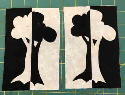
A simple exploration of this concept is to create mirror image compositions.  The photos below show the process with a simple tree drawing, and black and white fabrics.

  1. Begin with a simple drawing. Add lines to indicate where the design can be cut into 2 halves.
  2. Transfer the drawing to paperbacked fusible and iron to black fabric
  3. Cut the design in half and then cut the tree from the background.
  4. Fuse the back pieces onto white fabric as shown.
simple tree drawing for notan exploration

Explore notan using a simple design.

Mirror image tree with 2-value notan.

Mirror image tree with 2-value notan.

Here is another version of this experiment using 3-value notan.

tree drawing is used to create various versions of a 3-value notan

Mirror image tree composition created with 3-value notan.

Evaluate Positive & Negative Space Using Notan

The concept of notan can be used evaluate or develop a pictorial composition that is balanced and pleasing.  Here is a 5-step process:

  1. Open an image in a photo-editing program

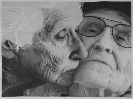
    A close up portrait of an older couple. The woman leans down to kiss the cheek of the man. He is leaning back, eyes closed, and skin is pale. ©2019, Lea McComas, The Long Goodbye, fabric and thread, 44 x 33 inches, $5200. Artist statement:There is a gentle tenderness between two souls that have traveled life's journey together.

    The Long Goodbye

  2. Grayscale the image

    Composition in grayscale.

    Composition in grayscale.

  3. Posterize at 2 levels.

    Composition posterized in 2 values.

    Composition posterized in 2 values.

  4. Change mottled areas to white, or black.

    Composition in 2-value notan.

    Composition in 2-value notang.

  5. Evaluate the interaction of black and white shapes.  If the interplay between black and white; positive and negative space is interesting, this is an indication that the composition is appealing.  

Managing positive and negative space is no guarantee that you will create a masterpiece.  Consider this just one of the ingredients in the recipe for success.

Learn More in My  Color & Composition Class

Interested in learning more? Every month I lead a Color and Composition class where we explore a color scheme, color concept, and a composition concept.  We meet online  the 4th Saturday of every month 1:00-3:00 PM MDT. To join us, sign up through the Rocky Mountain Quilt Museum.

Subscribe to this blog for future summary updates on topics covered in the Color & Composition class.

Share