A balanced color scheme is a key component of a successful art quilt, or any other artistic endeavor. I have a method to create a solid scheme, identify a missing color, or fix a scheme that doesn’t work. I discussed this topic in my most recent Color & Composition class and share a summary of that information here. If you are intrigued, information about future Color & Composition class sessions can be found at the bottom of this article.
Create a Color Scheme with Reflective Symmmetry
The color wheel is an essential tool in this process. Most come with features that prompt various color schemes using triangle, rectangle, or square shapes.

Color scheme guides on color wheels
A common feature of each of these shapes is that they have reflective symmetry; also referred to as bi-lateral symmetry. This means that you could draw a line through the shape so that one side is the exact reflection of the other. You could fold that image on the line and have both halves match exactly.

Shapes with Reflective Symmetry
Create a More Colorful Scheme
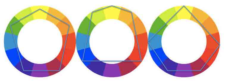
It is possible to stretch beyond the standard color schemes, and still maintain harmony and balance. The key is to use colors that create a shape with reflective symmetry. For example, when using 5 colors, think of a simple house shape. Make your dominant color the peak of the roof. The next 2 colors will be the corners where the roof turns into walls, and the final 2 colors will be the base of your walls.

Variations of a 5-color scheme
The colors may not be evenly spaced, but, if the guiding shape has reflective symmetry, you will create a scheme that has harmony and balance.
Complete, or Fix, a Faulty Color Scheme
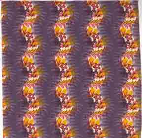
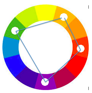
Maybe you have a set of colors that are must-haves in your quilt project, but you want to be sure that the overall scheme is solid. In my example below, I’m starting with an ugly fabric that has sentimental meaning. To begin, I place markers on the color wheel to indicate the colors in this fabric. In this case my colors are violet, red-orange, yellow-orange, and these do not create a shape with reflective symmetry.

ugly fabric color scheme is asymmetrical

Ugly fabric
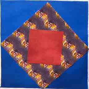
Add a fourth color to create a color scheme that has balance and harmony. Here are 2 possible options. First, adding blue to the scheme will balance it.

Add blue to create a trapezoid.

Fabric Swatches show blue in the mix.
Replace blue with green to create another balanced color scheme.

Option 2: add green to the scheme

Add green to the mix.
Make the scheme more complex by adding both blue and green. This will also create a pentagon shape on the color wheel; and a shape with reflective symmetry.

Balanced Scheme with 5 colors.

5-color scheme that is balanced
Learn More in My Color & Composition Class
 Interested in learning more? Every month I lead a Color and Composition class where we explore a color scheme, color concept, and a composition concept. We meet online the 4th Saturday of every month 1:00-3:00 PM MDT. To join us, sign up through the Rocky Mountain Quilt Museum.
Subscribe to this blog for future summary updates on topics covered in the Color & Composition class.
