Today I want to focus on the design concepts of repetition & rhythm, and how we can put these to work in our quilts. This content was covered in the last session of my Color & Composition class. If you are interested in joining us for future sessions, I’ll put a link at the bottom, but for now…
Repetition, Repetition, Repetition
Repetition is about using a design element over and over. A repeated element gives a sense of familiarity and comfort. This could be a repeating line, shape, or pattern.
Repetition is something that we are naturally drawn to; something we bring into our world. Here are some examples that I found in my own environment.

multiple drawers with repeating hardware
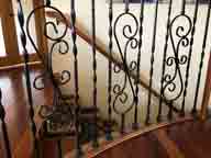
Repetition in the stair railing.

repeating design in a rug
Many artists will repeat an element in every piece.

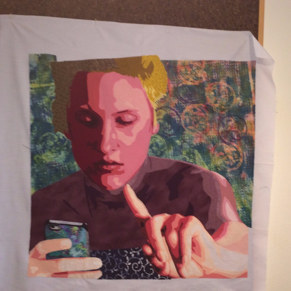
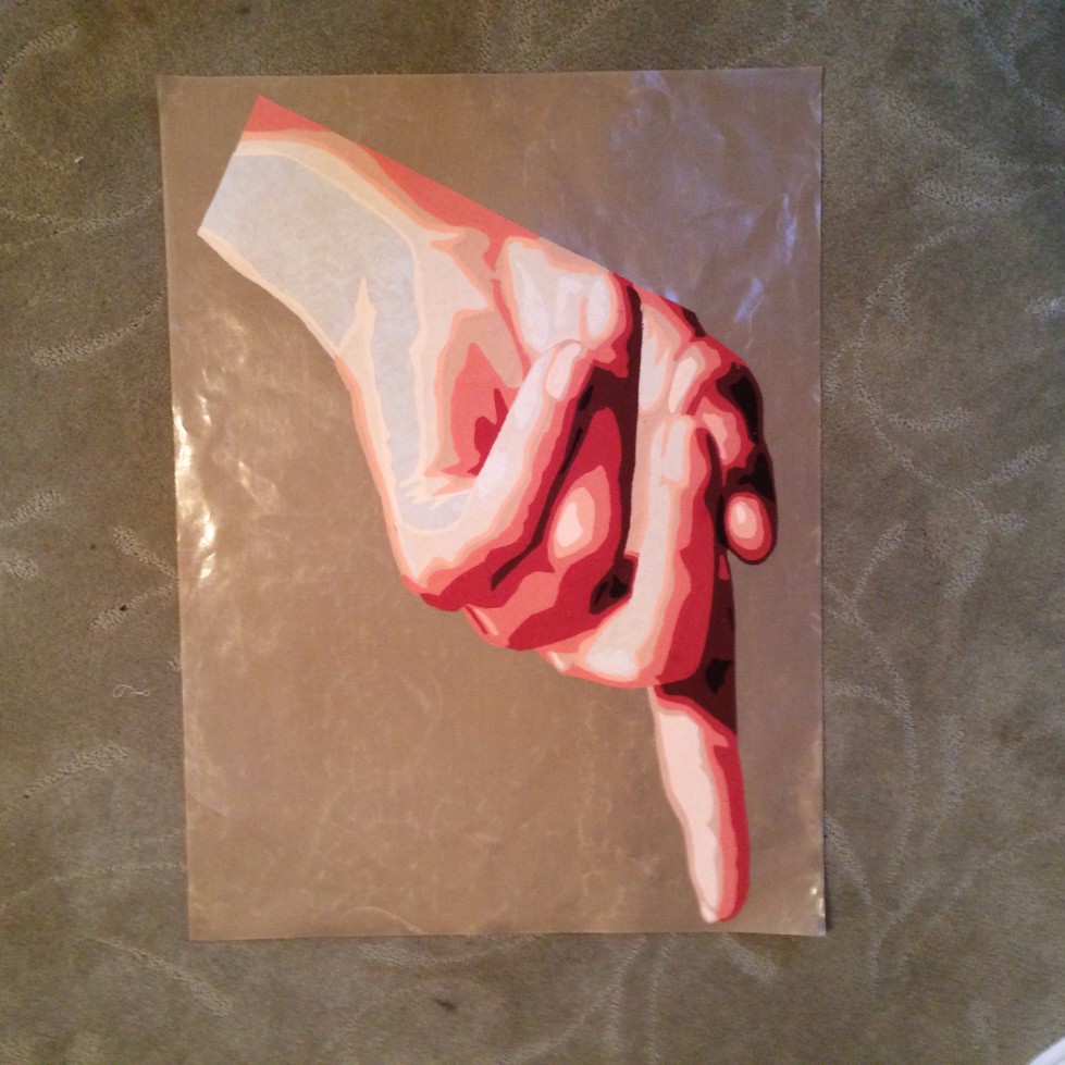
Beyond the Edge: My Signature Move
It becomes their signature move, something that makes their work easily recognizable to viewers, and fans. My signature move is to take an element off the edge of my work. See more examples in my genre gallery.
Within a composition, repetition can be as simple as repeating a line, shape, color, texture.
As I’ve been working in recent months to update the online galleries for the Border Wall Quilt Project, I’ve found many wonderful examples of repetition. Here are a few.

Repeating element-hearts. Brick by L K.
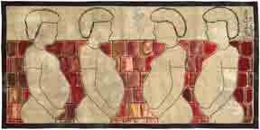
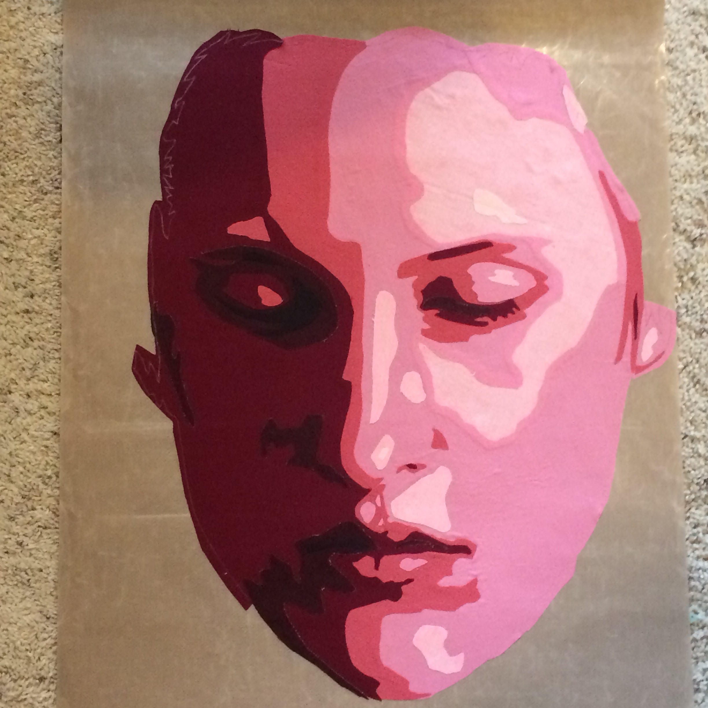
Repeating element – woman. Brick by Cynthia Catlin.

Repeating element – brick. Brick by Cynthia Catlin.
Pattern is created when more than one element is combined and repeated.
Here are examples from the BWQP where I think this idea of pattern is used effectively.
Pattern of repeating vertical and diagonal lines. Brick by Maude Wallace Haeger.

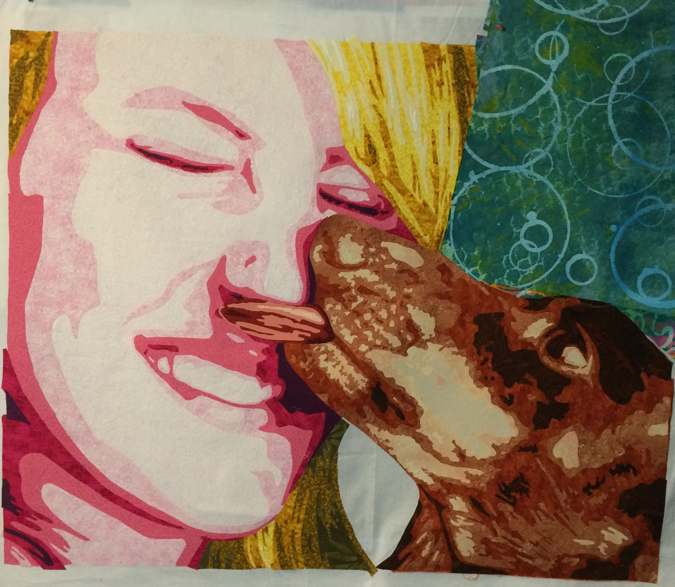
Repeating pattern of stripes and coffins. Brick by Karen Sullivan
Rhythm, Rhythm, Rhythm, Rhythm
Conversely, Rhythm is about the space between repeating elements. It adds interest and excitement..Today, let’s look at 5 types of Rhythm:
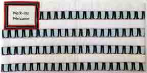
- Random Rhythm has no regular interval between repetitions. They can be all over the place.
Random Rhythm. Brick by Ramona Bates.
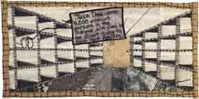
2. Regular Rhythm occurs when the interval between repetitions is the same. For example, your heartbeat is a regular rhythm, or, at least it should be. Here is a quilted example.
Regular Rhythm. Brick by Price & Pampusch.
3. Alternating Rhythm is the switching back and forth between 2 regular rhythms. Chess board is a simple example. However, these rhythms can be much more complex.

Alternating Rhythm. Brick by Ramona Bates,
4. Flowing Rhythm exists when repeated elements follow a curved or undulating line. Here are some examples.

Flowing Rhythm. Brick Carol Chewning.
5. Progressive Rhythm results from changing a characteristic of an element as it is repeated. These next examples show different ways that rhythm can progresses.
This sample shows an increase in size and color change.
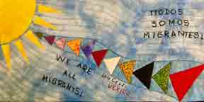
Progressive rhythm. Brick by Lourdes Cruz, Mexico.
This next brick shows multiple scenes of a story. This is called simultaneous narrative.
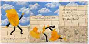
example of progressive rhythm with simultaneous narrative. Brick by Sheryl D Rodda
Put Yourself to the Test
Look at the examples below and identify the type of rhythm in each. The answer key is below.
1.

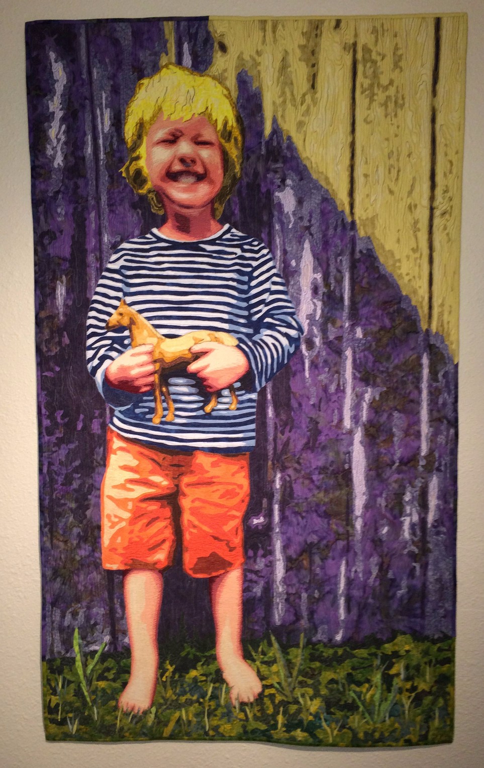
Brick by Sally Maxwell
2.

Brick by Pat Hilderbrand.
3.

Brick by Linda Laird
Monthly Color & Compositions Class
If you would like to join us, my Color & Composition class is sponsored by the Rocky Mountain Quilt Museum on the 4th Saturday of every month through the end of 2021. In each session we explore a color scheme, a color concept, and a concept related to composition.
Answer Key: 1. alternating, 2. Flowing and progressive. 3, random