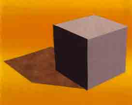
Can color temperature indicate the health of your quilt? These days, having a fever is cause for concern. Staying home and

Does you fabric have a temperature?
away from others gives me more time with my fabric, where temperature has also been on my mind. It was a topic in my monthly Color & Composition class. Read on for a summary of our discussion and learn how you can join us next month.
Color Temperature: What is Warm? What is Cool?
The exact dividing line between warm & cool colors has been an open topic for centuries.

What is your preference?
Your preference likely depends on your medium: a digital graphic artist lives in a different color world than a fiber art quilter. Here is what I work with…

Here are my play groups for warm and cool colors.
I also think of red and green as temperature neutral. They can function with either play group, but will be the coolest kids in the warm group, and the hottest kids in the cool group.

What’s cool in the warm group?

What is warm in this cool group?
How Color Temperature is a Tool?
It’s a fact that warm colors advance and cool colors recede! In a composition, we can create a sense of depth using temperature. Warm colors will seem closer to us and cool colors will fall to the background. Or do they? Do we know this because someone told us, or because we have experienced it? I say, “You don’t really own that knowledge until you test it out.”
So, I created a series of simple compositions of a box on a background. These are only 8 x10 inches, easy to make, and keep on hand for future reference.
Color Temperature: Warm vs Cool – Round 1
First, here is a box in a warm color sitting on a cool color background.

Does the box visually pop off the surface?
Now, here is the reverse: a cool color box on a warm color background.

What about this box?
If the concept holds true, the first version should appear to have more depth, and the background should fight for dominance in the second. What do you think?
Color Temperature: Warm vs Cool – Round 2
In my next experiment, I pitted warm and cool colors against each other in the same composition. Using a temperature neutral color green for the back ground, I put a large and small box together in the composition. Size will indicate to the viewer that the larger box is closer, but, how does color temperature amplify, or mute that message?


Warm vs Cool in Pictorial Quilts
These examples are very dramatic, but the concept can be used in more subtle ways. Color temperature is relative. Even within the “Warm” or “Cool” color play groups, each color will appear warmer, or cooler depending on what color plays next to it. For example, orange is cooler than yellow, but warmer than red. Also, blue is cooler than green, but warmer than violet.

I use this concept in all of my work. Look through my genre and portrait galleries to see how warm tones advance from the cooler backgrounds. When more than one person is included in a composition, I employ subtle temperature changes in flesh tones to make one figure more prominent, or appear closer than another.

Which figure has the warmer complexion?

How does temperature amplify depth in this piece?
Experience is the Best Teacher
Now, if you really want to own knowledge of this concept, you need to conduct your own experiences. It can be a simple as cutting out some circles of various sizes and colors, and then experiment with placing those circles on different backgrounds. You don’t even need to fix them permanently. Try one version, take a photo, rearrange, and take another photo.
If you try this, share a photo of your experiment with me: Lea@leamccomas.com
Learn More About Color Concepts
Every month, I teach an online Color & Composition class through the Rocky Mountain Quilt Museum. We meet via Zoom on the 4th Saturday of every month from 1:00-3:00 (Mountain Time zone). Each meeting is a chance to explore a color concept, a color scheme, and a composition concept. Come every month, or participate when you can. The cost is $20/ session. Click this link to join us.