Category Archives: Composition

Introduction to Thread Painting Course begins April 1.

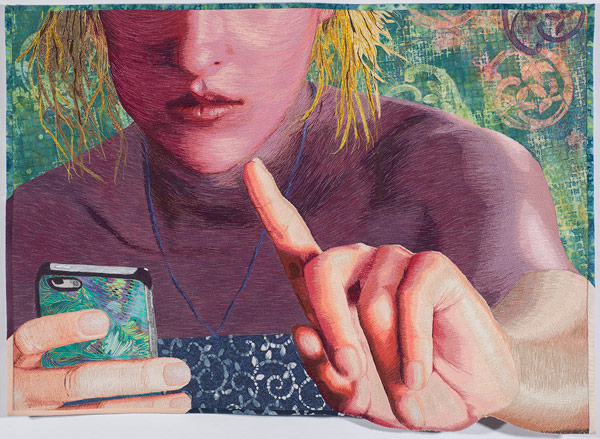
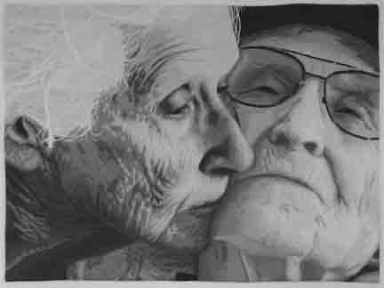
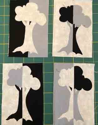
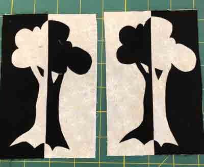
Excitement is building as the start date for my new online class is fast approaching. Introduction to Thread Painting begins April 1. That’s next week and there are still a few spaces available.

Additionally, in the coming months, I will begin Color & Composition courses, and will offer Coaching Sessions, along with free behind the scenes content for all to enjoy.

I feel strongly that connection is essential to successful learning, and hope to build a vibrant, sharing community where creators feel emboldened to learn and apply new skills and concepts. If this appeals to you, read on to find more details about each of my offerings…


Introduction to Thread Painting will begin April 1.

-Course includes 12 lessons that increase in difficulty and complexity to help you build yourstitching skills.

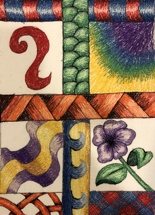
-Each lesson includes an instructional video, lesson notes, support materials, and ideas for further exploration.

Because I believe face-to-face contact is so important to learning: All participants are invited to join a weekly video check-in with Lea on Wednesday evening, or Saturday afternoon.

-A new lesson becomes available each Monday for 12 weeks, with an additional 4 weeks access to all course materials.

-The cost of the course for Beta testers is $180. That is just $15/lesson

To learn more CLICK HERE

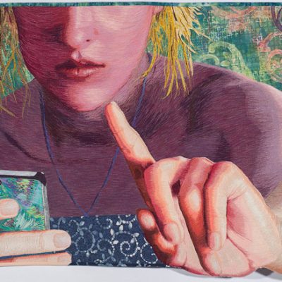
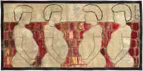
Color & Composition courses-Coming soon!

-Learn to use color with confidence by gaining an understanding of color theory and elements of composition. 

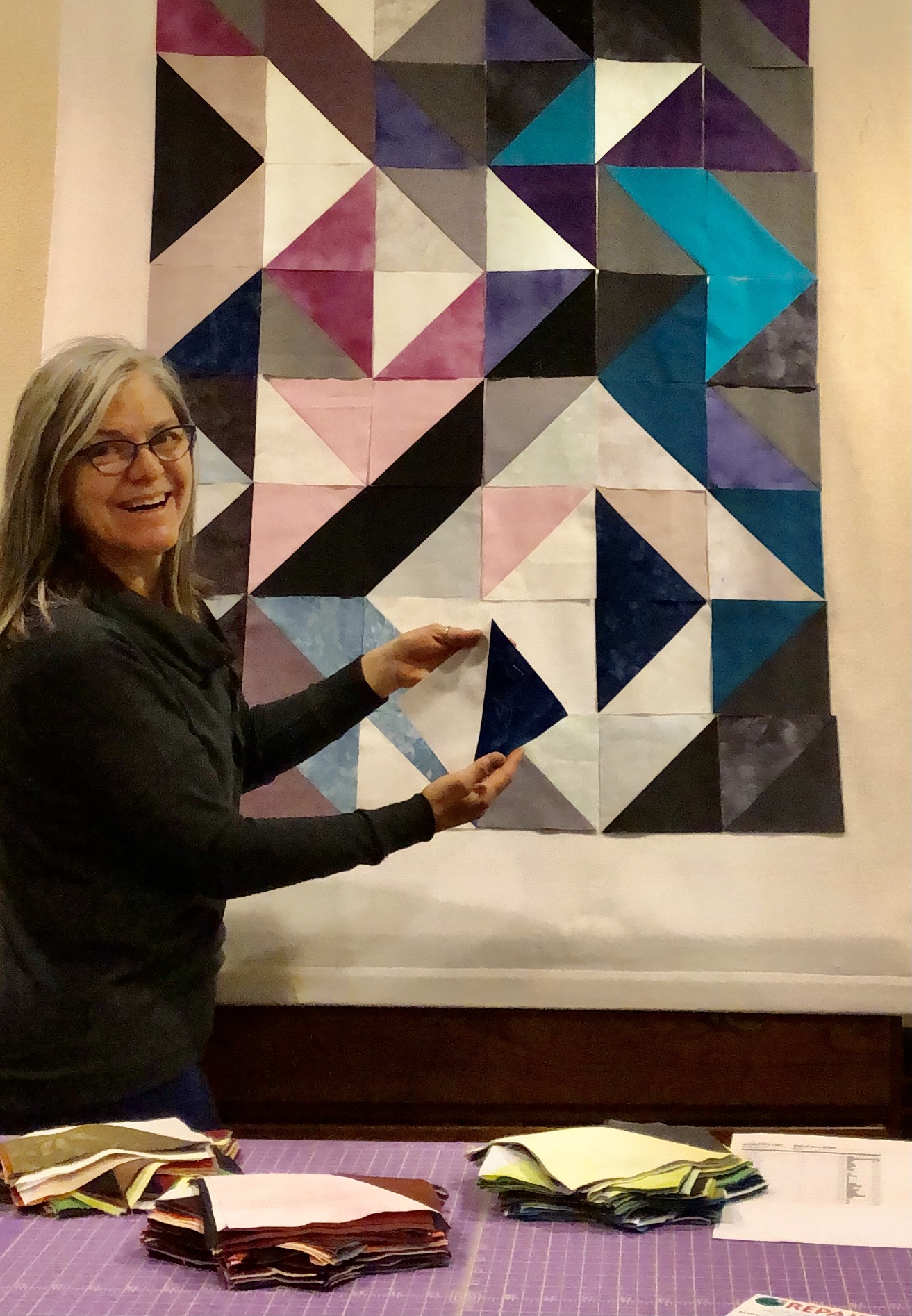
-There is so much information to cover on these topics that it will be divided into 2 courses. Color & Composition I will be available in June 2024, and Color & Composition II be offered in January 2025.

-Each class meets for a 2-hour online video session once a month for 6 months. 

-Each session features an in-depth look at a color scheme, a concept related to color, and another related to composition, along with ideas for further creative exploration.  

-Participants will respond to monthly challenges and share their work at the next meeting where we will celebrate and give feedback as requested.

-This is meant to be a very nurturing experience that provides inspiration and encouragement, while celebrating experimentation and artistic exploration.

To learn more about this, and other upcoming courses and offerings, CLICK HERE

Individual and Group Coaching Sessions available in the coming months.

-This is an opportunity to talk through iussues or obstacles encountered inyour creative process related to color, design, composition, or execution.

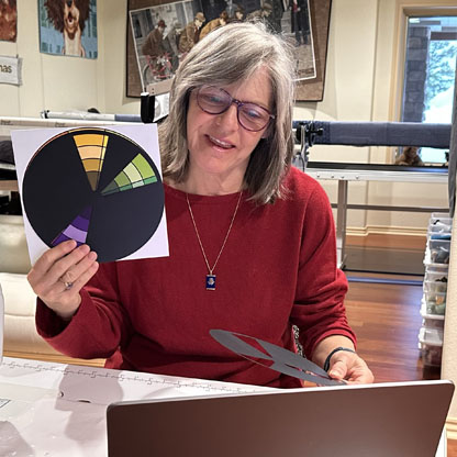
-Advice and guidance is also available related to submitting to competitions and exhibitions, publishing, and teaching about your work.

-Sessions are offered for 30 or 60 minutes via video conferencing.

-These are single session events, so no long tern commitment.

-Sessions are suitable for individuals, or a small group working on a single project.


If you want more information on Coaching Sessions, CLICK HERE to add your name to the waitlist, and you’ll receive notice and more details as they become available.

Share

Play Date with Color & Composition

My success in creating award-winning fiber art, is due, in large part, to my continual search for

The Long Goodbye, ©2019, 

new knowledge and understanding of how art works; specifically understanding how colors and elements of a composition interact, or play together.  Many years ago, I began taking breaks from my “serious work” to just play with the scraps and leftovers. These play dates with color & composition provided a low-stress, no-cost opportunity to experiment, while engaging in the hands-on type of activity where I learn best.

Scrap Collages

Early on, I simply created small collages using leftover, fusible-back scraps from my applique portraits.  I just played with the scraps, not giving a great deal of thought to color or composition–working intuitively.

My success was mixed; some compositions were pleasing, and others were–well, a mess.

Because I really wanted to understand how I achieved success so that I could spend less time making crap, I became more disciplined in the process. I began to think of these exercises as science experiments with dependent and independent variables.

I asked questions like,

  • If I keep the colors the same, but alter the values of the various elements, how does that effect the overall composition?
  • How does the placement of various elements effect the balance of the composition? 
  • What combinations draw the viewer in? Send the viewer away?

Monochrome Tessellations

First, I started simple, working monochromatic and playing with symmetry and tessellation.


For the unfamiliar, here is a quick tessellation activity:  Using a scrap of rectangular fabric, cut a chunk, or shape out of 1 side and rotate it as I did above. Another option is to cut shapes from 2 adjacent sides and slide those shapes across to the opposite side as I did below.

These early attempts were quite simple. However, below are more complex monochromatic samples that I put together later. Still, each new iteration conjures more ideas.

(For more information on how light and dark values play together, visit my previous post on positive and negative space.)

tree drawing is used to create various versions of a 3-value notan

Mirror image tree composition created with 3-values.

Mirror image tree with 2-value notan.

Mirror image tree with 2-values.

I could have traveled down this rabbit hole indefinitely, but I didn’t.  In future play dates, I engaged with more complex color & composition schemes.  Next, I’ll share my explorations with complementary colors and radial design.

Play Date with Color & Composition Workshops

In time, these play sessions became the basis for a new workshop where I take participants through 6 color schemes and 6 composition schemes in a few short hours. Now, there are multiple opportunities to take this workshop. It is fast paced and fun, and everyone goes home with original works of art.

Let’s get together and work through this process in person. Please join me in one of my upcoming workshops. Below are the places, dates, and links to register.

Stitch Fest – Loveland, CO, April 13
Intro to Thread Painting, 9:00 AM-4:30 PM
Play Date with Color & Composition, 6:000-9:00 PM
 
 
Stitch Fest – Milwaukee, WI, May 25
Intro to Thread Painting, 9:00 AM-4:30 PM
Play Date with Color & Composition, 6:000-9:00 PM


Kansas City Regional Quilt Fest, June 14-17.
I’m teaching a variety of workshops every day.  Follow this link to see what is available.


Share
Use calipers to measure sashing and first border.

Quilt Borders and Sashing Using the Golden Mean

The Golden Mean and Calipers

Finding the perfect width for your quilt’s borders and sashing is easy if you use the Golden Mean.  If you aren’t familiar with this term, it refers to a sweet spot in the middle, between 2 extremes.  It divides a space so that one side is a bit larger than the other in a way that is harmonious and pleasing to the eye.  Also referred to as the golden ratio, it occurs often in nature.  To find this division of space, I love to use my Golden Mean Calipers.  As the calipers open and close, the center point, always indicates the Golden Mean, and two harmonious inner spaces.  

large and small Golden Mean Calipers

large and small Golden Mean Calipers

These calipers are available in the Creativity Tools section of my web store.

Perfect Borders Using the Golden Mean

Adjust the Golden Mean Calipers to measure the width of a quilt block

Measure the width of your block.

This tool is also useful when adding borders to a traditional block quilt.  One method is to start with the blocks themselves.  Place the outer points of the calipers at the edges of the blocks.  This will give you two new measurements that will be in harmony with the blocks. 

Use the larger measurement for the total width of the border. 

Use the larger of the 2 inner golden mean measurements for the finished width of the full border.

Create a single border matching the wider measurement of the calipers.

Divide this area further by placing the outer points of the calipers on the edges of the border area.  This will indicate pleasing widths for an inner and outer border. 

Divide the border area using the calipers.

The golden mean indicates the optimum width of borders and sashing.

Create harmonious smaller borders.

All measurements indicate finished sizes, so don’t forget to add seam allowances.

Perfect Sashing Using the Golden Mean

Use the golden mean to determine the width of sashing, as well as borders.  The smaller inner border width, determined above, is also the perfect width for sashing.  Sashing is used  between and around all of the blocks, and it serves to set the blocks apart for the purpose of highlighting each as an individual unit.

Borders surround the grid of blocks and visually hold them together.  Sashing adds to the visual weight of the grid layout, and creates the need for a larger border to maintain balance. Combine the width of the sashing and the single border to create a harmonious, larger, outer border, as shown below.

Use golden mean calipers to measure sashing and first border.

Measure sashing & border

Golden Mean Calipers indicate width of an additional border

Calipers indicate width of additional border

Borders and Sashing for a Predetermined Quilt Size

Sometimes, a specific finished size is necessary and the process described above will exceed those limits.  In this case,  if you know how wide the full border needs to be, but you want to break it down into multiple borders, the golden mean is a good way to do that.  Open the calipers to the full border width, and use the two inner measurements for multiple border widths.

No calipers – No Problem

You can also determine harmonious measurements without the calipers by using the magic number: 1.6.  Take any measurement.  Determine a larger size by multiplying by 1.6

Example: 5 x 1.6 = 8 

Conversely, divide by 1.6 to find a smaller measurement.

Example: 5 ÷ 1.6 = 3.125 (Round down to 3 inches)

Learn More in My Color & Composition Class

Interested in learning more? Every month I lead a Color and Composition class where we explore a color scheme, color concept, and a composition concept.  We meet online  the 4th Saturday of every month 1:00-3:00 PM MDT. To join us, sign up through the Rocky Mountain Quilt Museum.

Subscribe to this blog for future summary updates on topics covered in the Color & Composition class.

Share
Composition in 2-value notan.

Positive and Negative Space in Art Quilting

Effectively using positive and negative space is key to creating compelling art quilt compositions.

Positive space is the area of the composition that is happening, or of interest

Negative space is the area around the positive space, and the area that is NOT happening, often referred to as “The Resting Space”

You can’t have one without the other, and both serve attention.

Manage Positive & Negative Space in Art

Negative space doesn’t have to be boring to be effective. It is possible to focus the eye and draw attention to the positive space, but not waste the negative space.

In my portrait quilts, I often create the figure, then audition it on several backgrounds to see what works best.  White space worked well for my tribute to Malala, but something with more color and visual texture was needed to offset the solid mass of the figure in Busy Signal.

Portrait of Malala wearing a red scarf. Negative space is created with a white background. A Islamic floral border of blue and red flowers with green leaves. The center text is a quote by Malala Yousafzai, "With guns you can kill terrorists, with education you can kill terrorism.

Malala, by Lea McComas, 30″ x 50″, 2019.

Mottled and textural print fills the negative space to contrast with the bold figure irepresented with solid spaces.

Busy Signal, 25 in x 36
2017.

Auditions for Negative Space

Selecting appropriate fabric for negative space in your art is a skill that can be practiced in isolation. As with any skill: repetition builds proficiency.  I suggest you do the following exercise in a deliberate and thoughtful manner.  This experience will increase your knowledge base and make the process easier in the future.  

  1. Select a small motif. Begin with something simple, but repeat this process with more complex motifs.
  2. Select a group of fabrics to audition. Look for connections to the motif, i.e. color scheme, shape, line, texture.
  3. Place the motif on each of the fabrics and take a photo reference.
  4. Make notes about the effect and the appeal of each combination.
  5. Also, not the kinds of contrast that are at work: color, value, pattern, line.
a simple seashell motif is auditioned on a variety of fabrics.

Auditions with simple motif.

options to fill negative space with complex motif

Auditions with complex motif.

Notan: Light-Dark Harmony

Notan is a Japanese terms that means light-dark harmony.  This is a way of looking at positive and negative space in terms of value.

The concept is that a composition works well when the light and dark spaces appear in balanced proportions and they work together to create interesting shapes. The light areas should group together and the same for dark areas. Notan commonly done in 2 values, can also work with 3 or 4 values.

Easy Notan Exploration

A simple exploration of this concept is to create mirror image compositions.  The photos below show the process with a simple tree drawing, and black and white fabrics.

  1. Begin with a simple drawing. Add lines to indicate where the design can be cut into 2 halves.
  2. Transfer the drawing to paperbacked fusible and iron to black fabric
  3. Cut the design in half and then cut the tree from the background.
  4. Fuse the back pieces onto white fabric as shown.
simple tree drawing for notan exploration

Explore notan using a simple design.

Mirror image tree with 2-value notan.

Mirror image tree with 2-value notan.

Here is another version of this experiment using 3-value notan.

tree drawing is used to create various versions of a 3-value notan

Mirror image tree composition created with 3-value notan.

Evaluate Positive & Negative Space Using Notan

The concept of notan can be used evaluate or develop a pictorial composition that is balanced and pleasing.  Here is a 5-step process:

  1. Open an image in a photo-editing program

    A close up portrait of an older couple. The woman leans down to kiss the cheek of the man. He is leaning back, eyes closed, and skin is pale. ©2019, Lea McComas, The Long Goodbye, fabric and thread, 44 x 33 inches, $5200. Artist statement:There is a gentle tenderness between two souls that have traveled life's journey together.

    The Long Goodbye

  2. Grayscale the image

    Composition in grayscale.

    Composition in grayscale.

  3. Posterize at 2 levels.

    Composition posterized in 2 values.

    Composition posterized in 2 values.

  4. Change mottled areas to white, or black.

    Composition in 2-value notan.

    Composition in 2-value notang.

  5. Evaluate the interaction of black and white shapes.  If the interplay between black and white; positive and negative space is interesting, this is an indication that the composition is appealing.  

Managing positive and negative space is no guarantee that you will create a masterpiece.  Consider this just one of the ingredients in the recipe for success.

Learn More in My  Color & Composition Class

Interested in learning more? Every month I lead a Color and Composition class where we explore a color scheme, color concept, and a composition concept.  We meet online  the 4th Saturday of every month 1:00-3:00 PM MDT. To join us, sign up through the Rocky Mountain Quilt Museum.

Subscribe to this blog for future summary updates on topics covered in the Color & Composition class.

Share
diptych of 2 native American men on horseback crossing a river. On left panel the man turns to look at the viewer. On the the right panel, the man is riding away from the viewer.

Create Depth with Atmospheric Perspective

Art quilters can create the illusion of depth with atmospheric perspective when they apply four key color concepts in pictorial quilts.  Creating depth with atmospheric perspective was one of the topics I discussed in my monthly Color & Composition class.  Read on for a summary of that part of the discussion.  If you are intrigued,  information about future Color & Composition class sessions is at the bottom.

The Illusion of Depth in Art

There are two types of perspective that can be employed in your art quilts to create the illusion of depth in a pictorial work such as landscape or seascape. The first is linear perspective; the use of 1 or 2 vanishing point with lines in the composition converging on those points.  This is the most commonly recognized and used method for creating that illusion of depth.  Raphael’s painting, School of Athens, is a great example.  Notice that the architectural lines lead to a single vanishing point in the center of the composition.

Inspiration for Women's Work

School of Athens by Raphael, 1509-1511.

A second method is to create the illusion of depth with atmospheric perspective.  This method relies on manipulation of color to create the illusion of depth.  Saint Francis of Assisi Receiving the Stigmata, by Jan van Eyck provides an example of this.  Compare the elements in the foreground with those that appear to be far in the distance.

An illusion of depth using atmospheric perspective is evidenced in this painting of 2 priests in brown cloaks kneeling on the ground among rock outcroppings with city visible in the distance.

Jan van Eyck, Saint Francis of Assisi Receiving the Stigmata, 1430

Keys to Create Depth with Atmospheric Perspective

With the great masters as our inspiration, let’s shift our focus to art quilting and the selection of fabrics for landscape quilts.  There are 4 key considerations.

Texture

Represent the textures of items that are close to the viewer such as plants, rocks, clothing, furniture.  Less textural detail should be visible in elements that appear in the mid-ground,  and eliminate textural detail in the background. Quilters also have the option of adding texture with stitching and surface embellishments.

An illusion of depth using atmospheric perspective is evidenced in these three sets of fabrics show heavy medium and light texture in three colors: gray, red-violet, green

Fabric selection based on texture and depth.

Value & Value Range 

Moving from foreground to background, the value range should narrow.  Render elements in the foreground  with a broad value range from very light to very dark. Reduce the value range to make elements appear further away by eliminating the lightest and darkest values.  Also, shift the value range to the lighter end of the value scale because darker values are lost to a greater degree than lighter values. 

2 grayscales, fingers show use of values used in atmospheric perspective. Light to dark used in foreground. light to medium dark used in background.

Value range for atmospheric perspective

An illusion of depth using atmospheric perspective is evidenced in this art quilt of park bend on outcropping overlooking receding ridges of tree covered hills in a snowstorm.

Winterscape

Clarity

Elements become less defined as they move to the distance.This is related to texture.  Texture would be how you represent the surface of a object, Clarity focuses on the shapes of objects The edges of your shapes will soften and become more blob-like as those objects move to the distance.  Below is a simple seascape composition that I created as a class sample.  In the detail view of the palm trees, notice how the outline of the palm fronds is simplified in the tree on the right.  Id I were to add a third tree further in the distance, the palm fronds would have gentle curving edges in contrast to the jagged edges of the foreground and mid-ground trees.

beach scene in fabric with two palm trees on the left and an island at the horizon on the right.

Beach scene

An illusion of depth using atmospheric perspective is evidenced in the tops of two palm trees showing greater clarity in the foreground tree

beach scene detail of palm tree tops

Temperature

Warm colors advance and cool colors recede.  When selecting fabrics for a composition, make note of the colors that will appear in the foreground, mid-ground, and background. For colors that repeat at various distances, selected warmer versions to appear closer, and cooler versions to appear in the distance.   For example, the color red in the foreground could be a warmer red-orange, while red in the distance could be a cooler red-violet.  Look below at Crossing Over.  The water in the foreground is a mix of blue and blue-green, but is rendered in blue-violet in the background.  The foliage on the distant back is green near the water’s edge and blue-green on the more distant hills.

diptych of 2 native American men on horseback crossing a river. On left panel the man turns to look at the viewer. On the the right panel, the man is riding away from the viewer.

Crossing Over, diptych by Lea McComas

Water detail in Crossing Over shows atmospheric perspective as foreground in in blue-green to blue, and back ground is done in blue-violet.

Water detail in Crossing Over

Figure & background detail of Crossing Over shows foliage in front in green colors with background foliage in blue green. Warm reds and blues in clothing of figure pop forward in the composition.

Figure & background detail of Crossing Over

Create Depth in the Sky

When it comes to the sky, we often forget to create depth using atmospheric perspective. Treat the sky as an element of the composition.  The top of the composition is the foreground, and sky near the horizon line is the background.  Sky should be a warmer, more saturated color at the top of the composition and move to a cooler, less saturated color at the horizon.  A common mistake is to use a solid blue fabric, or a printed sky with cloud fabric.  The problem is that these fabrics present a static representation of the sky that make it appear flat. They fight the illusion of depth, rather than support it.  I suggest a hand-dyed or ombre fabric to support depth using atmospheric perspective.

fabric sample of blue sky with clouds.

Sky with clouds

flat light blue square

Flat sky color

blue square with vibrant color at the top and pale color at the bottom

blue sky ombre

Join our next Color & Composition Session

Interested in learning more? Every month I lead a Color and Composition class where we explore a color scheme, color concept, and a composition concept.  We meet online  the 4th Saturday of every month 1:00-3:00 PM MDT. To join us, sign up through the Rocky Mountain Quilt Museum.

Subscribe to this blog for future summary updates on topics covered in the Color & Composition class.

Share

Unity & Variety Create Harmony & Interest

Unity & Variety are tools to create harmony and interest in art quilt compositions, and were the elements of composition that  we explored in the last session of my monthly COLOR & COMPOSITION class.  In this  blog I’m sharing some of the highlights of that discussion.

UNITY refers to a relationship between the elements within a composition that bring harmony.  The desired effect is to create the feeling that a work is a single creation with multiple parts, as opposed to, a collection of separate things.

Composition with unity

Round place mat with various items including a plant, fork, pen, latex glove, and pliers.

Composition with disunity

Techniques to Create Unity.

A number of techniques can be used to create unity.

Visual Repetition

Visual repetition is probably the most common way of creating unity.  Repetition gives a

Analogous scheme with blue & yellow parents.

Analogous scheme with blue & yellow parents.

sense of familiarity.  As humans, we prefer familiarity over anomaly.  This can play out in various ways:

Color Scheme– Choosing a scheme brings focus and consistency.  Each color is a part of a larger structure.

Line-Repetition of lines is more than having multiple lines.  It is also about repeating the same kind of line, such diagonal, horizontal, s-curve, or spiral.

Shape:  Shapes can be geometric or organic.  They can vary in size, or color. In eluding multiple versions of the shape creates familiarity and harmony.

Proximity

Placing items near each other creates unity through grouping.  This is where negative space is important.  If you are going to create a space for items to gather, there also has to be a place where they do not gather.  This “negative space” will be a topic in our next Color & Composition session.

Still life composition with potted tree in front of a window next to a trunk covered by a hand women mat. A tin cup and pitcher sit atop the trunk with a small plate with tangerines. One is peeled and divided.

Turkish Treasures Still Life, 2020.

This still life composition was created for an article I wrote for Quilting Arts Magazine (April/May 2020).  It illustrates the concept of proximity.  I communicate that these objects go together by placing them in contact with each other, or overlapping them. 

Simplicity

Eliminate unnecessary elements in a composition so that the focus can be on what is important. Too many different things competing with each other creates confusion and discomfort.

When I teach my portrait class, students work from a photo.  One of the first things I talk about is cropping out anything that is in the background that has nothing to do with the subject.  If it can’t be cropped, then distort, blur, or replace it.  This is what I did in Sweet Song From and Old Fiddle.

Hand holding the neck of a fiddle is visible with a mottled blue-green background.

Detail of Sweet Song From and Old Fiddle, 34″ x 18″, 2013.

Thematic Relationship

You may have objects that don’t share other unifying qualities, but they share an underlying meaning.  A good analogy is the sewing machine: it is made of many different parts, but, put it all together and it it works. Remove a piece, and it doesn’t.

I remember a news report on January 20,  Inauguration Day that featured Donald Trump speaking at Andrews Joint Base in front of 17 American flags.  Apparently, the number 17 was important because Q is the 17th letter of the alphabet, and Q-Anon supporters believed this was a symbol of the revolution to come later in the day.

Consider those elements: American Flags, Letter Q, # 17, Revolution.

Regardless of your political leanings, that those elements were thematically connected, is astounding.—Scary as hell, yet, astounding.

The example I have to share with you is much more benign.  I give you Busy Signal where a cell phone, a hand with wait gesture, and a face cut off below the eyes send a message about communication and connection in our world.

Busy Signal, 25 in x 36, 2017.

Add Variety to Create Interest

Variety-of elements creates interest, breaks the boredom, and adds interest.  Again, there are various ways to do this.

 Altered Repetition

Incorporate an anomaly, a change in the repetition.  In the Circles in Squares example below, all of the elements share a color scheme, and the sizes and shapes are consistent, but offsetting, or slight shifting of elements adds interest.

Circles-in-Squares color study

Interrupt the Pattern

Another option is break a pattern my inserting a another element.  I did this in my tribute to Malala, by placing her image over a large floral border.

Portrait of Malala wearing a red scarf with a white background. A Islamic floral border of blue and red flowers with green leaves. The center text is a quote by Malala Yousafzai, "With guns you can kill terrorists, with education you can kill terrorism.

Malala, by Lea McComas, 30″ x 50″, 2019.

Color & Composition Monthly Workshop

Interested in learning more? Every month I lead a Color and Composition class where we explore a color scheme, color concept, and a composition concept.  We meet online  the 4th Saturday of every month 1:00-3:00 PM MDT. To join us, sign up through the Rocky Mountain Quilt Museum.

Subscribe to this blog for future updates on topics covered in the Color & Composition class.

Share
repetition and rhythm

Repetition and Rhythm Add Comfort and Excitement

Today I want to focus on the design concepts of repetition & rhythm, and how we can put these to work in our quilts. This content was covered in the last session of my Color & Composition class.  If you are interested in joining us for future sessions,  I’ll put a link at the bottom, but for now…

Repetition, Repetition, Repetition

Repetition is about using a design element over and over.    A repeated element gives a sense of familiarity and comfort. This could be a repeating line, shape, or pattern.

Repetition is something that we are naturally drawn to;  something we bring into our world. Here are some examples that I found in my own environment.

repetition of design in furniture drawers and hardware

multiple drawers with repeating hardware

example of repetition in design

Repetition in the stair railing.

repetition as design element in hand woven rug

repeating design in a rug

Many artists will repeat an element in every piece.

elements of my art extend beyond the edge.

Beyond the Edge: My Signature Move

It becomes their signature move, something that makes their work easily recognizable to viewers, and fans. My signature move is to take an element off the edge of my work. See more examples in my genre gallery.

Within a composition, repetition can be as simple as repeating a line, shape, color, texture.  

As I’ve been working in recent months to update the  online galleries for the Border Wall Quilt Project, I’ve found many wonderful examples of repetition.  Here are a few.

BWQP brick by LK

Repeating element-hearts. Brick by L K.

BWQP brick by Cynthia Catlin

Repeating element – woman. Brick by Cynthia Catlin.

BWQP brick by Cynthia Catlin

Repeating element – brick. Brick by Cynthia Catlin.

Pattern is created when more than one element is combined and repeated.

Here are examples from the BWQP where I think this idea of pattern is used effectively.

BWQP brick by Maude Wallace Haeger

Pattern of repeating vertical and diagonal lines. Brick by Maude Wallace Haeger.

Repeating pattern of stripes and coffins. Brick by Karen Sullivan


Rhythm,     Rhythm,          Rhythm,     Rhythm

Conversely,  Rhythm is about the space between repeating elements. It adds interest and excitement..Today, let’s look at 5 types of Rhythm:

  1.  Random Rhythm has no regular interval between repetitions. They can be all over the place.

    BWQP by Ramona Bates

    Random Rhythm. Brick by Ramona Bates.

2.  Regular Rhythm occurs when the interval between repetitions is the same.  For example, your heartbeat is a regular rhythm, or, at least it should be.  Here is a quilted example.

 BWQP brick by Price & Pampusch

Regular Rhythm. Brick by Price & Pampusch.

3.  Alternating Rhythm is the switching back and forth between 2 regular rhythms. Chess board is a simple example. However, these rhythms can be much more complex.

BWQP brick by Ramona Bates,

Alternating Rhythm. Brick by Ramona Bates,

4.  Flowing Rhythm exists when repeated elements follow a curved or undulating line. Here are some examples.

BWQP brick by Carol D Chewning

Flowing Rhythm. Brick Carol Chewning.

  5. Progressive Rhythm results from changing a characteristic of an element as it is repeated. These next examples show different ways that rhythm can progresses.

This sample shows an increase in size and color change.

BWQP brick by Lourdes Cruz

Progressive rhythm. Brick by Lourdes Cruz, Mexico.

This next brick shows multiple scenes of a story.  This is called simultaneous narrative.

BWQP brick by Sheryl D Rodda

example of progressive rhythm with simultaneous narrative. Brick by Sheryl D Rodda

Put Yourself to the Test

Look at the examples below and identify the type of rhythm in each.  The answer key is below.

1.

Brick by Sally Maxwell

2.

BWQP brick by Pat Hilderbrand

Brick by Pat Hilderbrand.

3.

Brick by Linda Laird

Monthly Color & Compositions Class

If you would like to join us, my Color & Composition class is sponsored by the Rocky Mountain Quilt Museum on the 4th Saturday of every month through the end of 2021.  In each session we explore a color scheme, a color concept, and a concept related to composition.  

Sign up here.

Answer Key: 1. alternating, 2. Flowing  and progressive. 3, random 

Share