
Analogous Color Schemes were one of topics discussed in my last
online Color & Composition class. I hope the information presented here will inspire you to explore this color scheme. If you find this helpful, and want to join me for the next session, you will information at the bottom.
 Analogous color schemes include a run of colors next to each other on the color wheel. These schemes can include 3, 5 or 7 colors. They work best when built around primary colors. Like a monochromatic scheme, analogous schemes are great for conveying strong emotion. They also have

Analogous Scheme with mother Yellow.
greater potential for energy and interest.
Analogous is a word that references a collection that has something similar, or a direct connection that applies to each element. The strong relationship among the colors in this scheme creates a sense of harmony. There is a kind of kinship.

Analogous run with 7 colors
Analogous Colors Schemes are like Families.
One way to build analogous color schemes is to begin with a primary

Analogous scheme with red mother
color. Think of this as the mother, and then expand to include the color, or child, on each side. Expand the scheme further to 5 colors by including the father of each child. In this analogy, it is easy to understand that managing the harmonious effect of this scheme becomes more challenging, as the family gathering expands.

Analogous scheme with 2 primary parents
Another way to build analogous color schemes is to choose two primary colors. Think of these as parents. Then, include all of the children, or colors, in between. Reduce the color scheme to 3 colors by eliminating the parents and using just the siblings,.
In either case, the scheme can be expanded further to include 7 colors. However, expanding this much requires incorporating a set of direct complements. Direct complements bring a lot of energy. That drama can disrupt the family harmony. Think of these as the mother-in-laws.
Analogous run with 7 colors
No Sleepy Schemes
With the colors being so close on the color wheel, analogous color schemes have the potential to be a bit boring, or sleepy. Increase variety within the scheme to combat this. One way to do this is through an expanded scheme. The advantage of a 5-color scheme over a 3-color scheme is the ability to increase the color contrast. Look at the examples below.

fabric swatches for 3-color scheme

fabric swatches for 5-color scheme
Another strategy is to emphasize one color within the scheme over the others. Any color within the scheme can be the star of the show. However, luminous colors, such as yellow, will naturally want to be the center of attention. Manage the scheme by using purer hues, and more intense versions of the color to be emphasized. Likewise, use more tints, tones, shades, and less intense version of the other colors.
3 Analogous Experiments
I spent a day experimenting with various analogous color schemes. Working with 5 colors, I chose a hue, tint, and shade of each color, and then mixed in a collection of neutral gray fabrics. In each experiment I created 48 half square triangle blocks and then arranged various compositions on the design wall.
Experiment 1: Mother Red
This analogous run stretched from violet to orange. Here was my final composition. The grayscale image shows how value is also at play.

Analogous scheme built around red.

Grayscale view of Red analogous scheme.
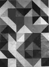
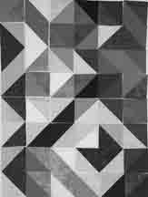
Experiment 2: Parents Blue and Yellow
Here is my analogous run with two primary parents and their children. The grayscale image is also included.

Analogous scheme with blue & yellow parents.
Grayscale view of Yellow-Blue scheme.
Breaking the Rules
What happens when the analogous color scheme is built around tertiary colors, instead of primaries?
In my third experiment, I built a scheme with blue-violet as the central color, stretching from red-violet to blue green. Using the family analogy, this is like loosing the parent red at one end of the run, and bring in the mother-in-law at the other end of the run. My results were less than ideal, but not a total disaster. Blue-green definitely feels like an outlier in this scheme. It is the only color with a touch of yellow. See my results below.

Scheme based on tertiary colors
Grayscale view of tertiary scheme.
In the next Color and Composition class we’ll delve deeper into the analogous color scheme and take a look at an Accented Analogous Scheme. We meet on the 4th Saturday of every month 1:00-3:00 PM MDT. To join us, sign up through the Rocky Mountain Quilt Museum.
Subscribe to this blog for future updates on topics covered in the Color & Composition class.
