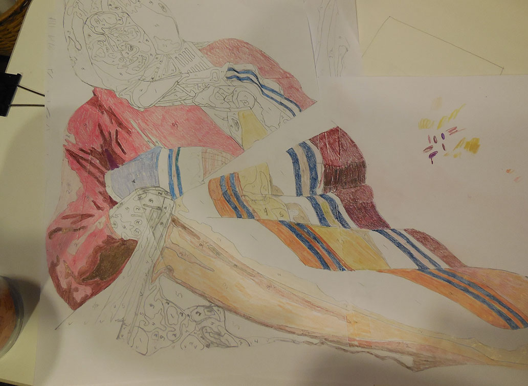
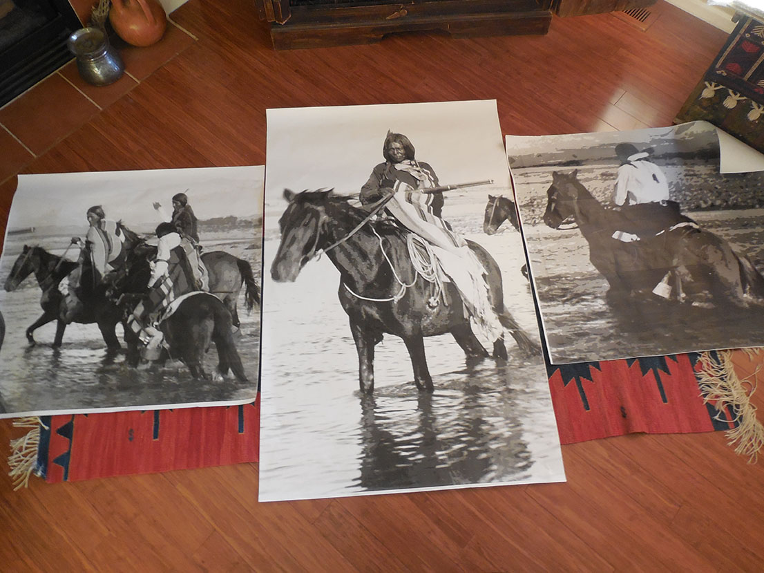
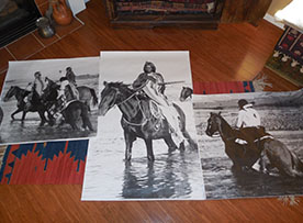
I’ve been away from the blog for a while, but, as you might have guessed, progress did continue on the horseman. In my race to finish it in time to submit to the Houston quilt competition, all available resources were diverted to making progress on this piece. I did take some photos along the way and will share that progress with you in my next few blog posts.
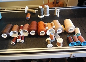
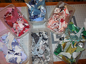
Shiny and dull threads for this horse
This week, let’s focus on the stitching of the first horse.
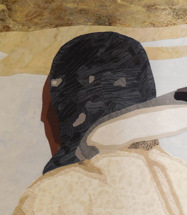
I selected a variety of threads in the full value range. This first horse is pretty dark, and if I think about what the horse would look like in real life, my thread choices would fall in the medium to dark range. My analytical brain has to take over to pick the very lightest threads. Because this horse is standing in water, a selection of threads with dull and shiny finishes were chosen to differentiate between the wet and dry parts of the horse.
Often, stitching begins with the lightest threads, working toward the dark areas, but this time, I did the opposite. I can’t say why with certainty. Perhaps it’s because the dark threads will complete most of the stitching and the lighter threads will add the finishing touches. The first step is to make some broad, sweeping stitch lines to hold things in place. That is followed by several passes, filling in more and more each time.
These photos show how the work progressed.


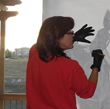
While working up close, it’s hard to fully appreciate what is happening. I have to rely on
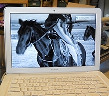
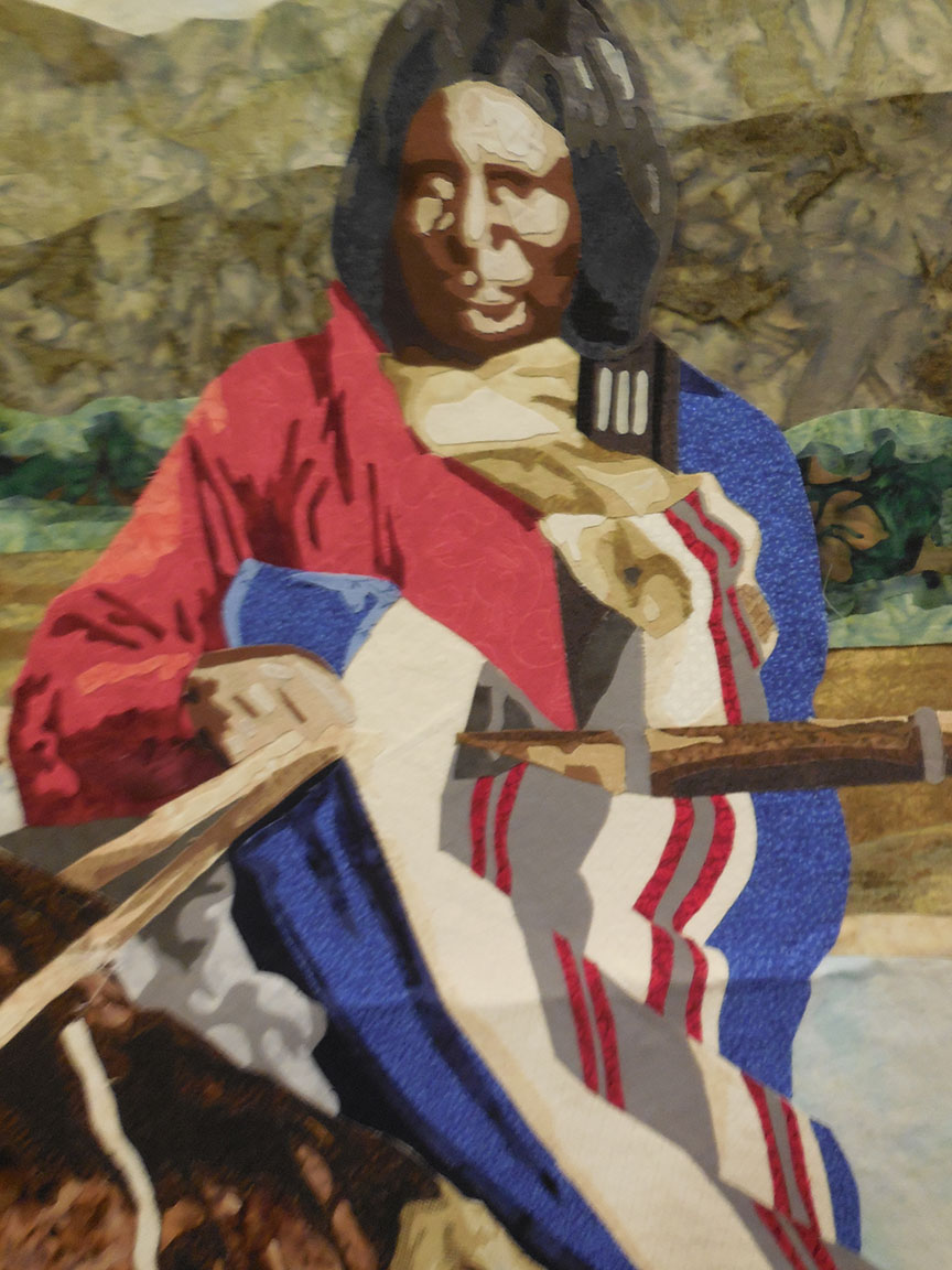
Reference photo on the computer
what I know should work as I’m stitching. I also keep my laptop near by with a reference photo on display. It is always such a treat to step back and look at the work and be able to appreciate that it has come together as planned. Sometimes, it’s even better, like the stitching along the neck of this horse. That’s when I smile, pat myself on the back, and say, “Lea, you’ve done well. You should have some chocolate.”
After a cup of tea and a few Thin Mint cookies, I had to admit that I was not thrilled with the nose. More on that next week…