Tag Archives: progress

Puppy Love, Part 2

Oh joy!!! I’ve finished something in less than a month; 2 1/2 weeks actually.  It’s such a thrill to jump into a project and just breeze through to the end.  With this piece, I took a break from thread painting and just did some dense stitching.  The new challenge was to establish some designs that would fit with each element of the composition.

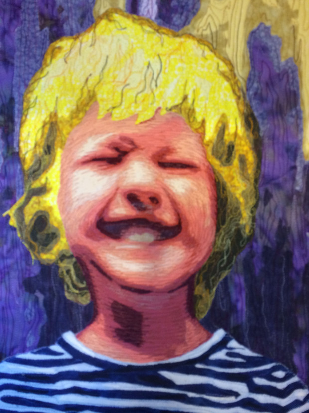
The blonde hair of the girl was easy.  I used various values of yellow threads in long, undulated lines of stitching.

PL hair

Next, similar, but shorter, wavy lines were put down with some variegated threads in a pattern that alluded to the hair of the dog.  Several times I had to stop and pet my dear Coco’s face in order to really understand the changing direction of her hair.  She didn’t mind too much.

PL dog

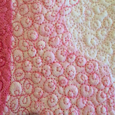
Stitching the face was a leap of faith.  It is so tricky to stitch the face!  If you try to recreate the actual contours, and the lines aren’t just right, it throws off the perceived shape and makes the face look distorted.  I decided to go in a completely new direction: loop-d-loops.  I covered the entire face in a small repetitive design that had nothing to do with its shape or contour.  I still varied the threads, letting the values do the work.  I’m really pleased with the results.

PL face

The background was the most troublesome decision, just as with choosing the fabric.  The print was complex and busy.  Afraid that it would become too strong and overpower other elements, I didn’t want to stitch the printed design.  I came up with a wandering ribbon design with a tiny meandering stitch to fill in the spaces.  I feel like the 2 patterns of the fabric and stitching sort of neutralize each other and take away their power to dominate.

PL background

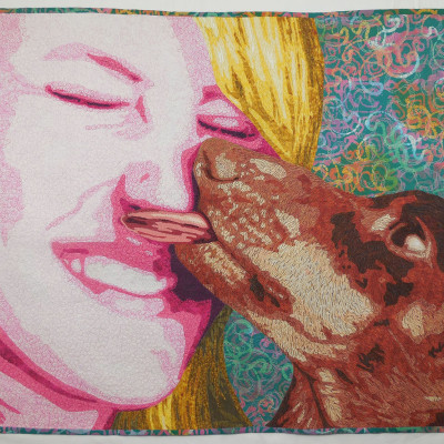
Finally, here’s the finished piece.Puppy Love

Share

Puppy Love, Part 1

Maya & Coco

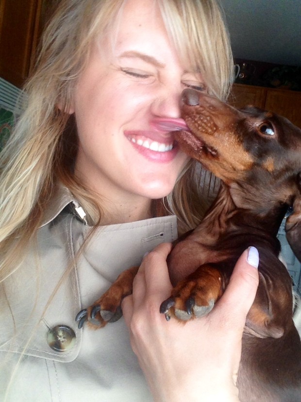
Maya’s selfie

This week I’ve jumped back into my art with gusto.  I’m tired of being on hold. I need to be creative!!  With a 4-day weekend and plans to pack and move postponed (again!) it was time to make up for lost time.

4" x 6" thread painting.

4″ x 6″ thread painting.


This past week has been devoted to making a piece titled “Puppy Love”.  I’ve done smaller versions of this piece in the past for small art auction donation pieces, but this one is big and bold.

It started with a selfie taken by my step-daughter, Maya with our little dachshund, Coco.  While previous versions were printed on fabric and thread-painted, this one is raw-edge fused appliqué and 30″ x 40″.

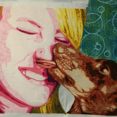
My color scheme is an analogous run of yellow-orange, orange, red, red-violet.  This kind of scheme tends to be calm and mellow, so, to punch it up, I threw in some blue-green.color scheme

A couple of marathon work days, and the piece was nearly completed.  Selecting the background fabric had me stalled for day as I just couldn’t decide.  I took audition photos with my phone and toggled back and forth between the shots until I was able to make a decision.

Background option 1

Background option 1

Background option 2

Background option 2


Now, it’s on to the stitching.  I’m going to try something new and will share that with you next week. Check back in next week.

Share

Is Your Face in the Right Place?

I’ve just finished a new piece titled “Simple Pleasures”.  It features a young boy named Indigo who is celebrating his 6th birthday and is thrilled with his new plastic horse.  How wonderful to find such pleasure in something that has no bells, whistles, screens, login, or even batteries.

In this weeks video, I show you how to check the size, location, and dimensions of facial features so that the face looks realistic and well proportioned.

Golden Mean Calipers Pt 3: Facial Features

This piece was a chance for me to try a bolder color scheme.  I like the energy and vibrancy of it. Below are process photos to show how the piece came together.

Face and Hands

Face and Hands

Shirt and shorts

Shirt and shorts

Horse in Hands

Horse in Hands

Thread-painted face

Thread-painted face

Finished piece

Finished piece


Share

A Horse of Course

I’ve been away from the blog for a while, but, as you might have guessed, progress did continue on the horseman.  In my race to finish it in time to submit to the Houston quilt competition, all available resources were diverted to making progress on this piece.  I did take some photos along the way and will share that progress with you in my next few blog posts.

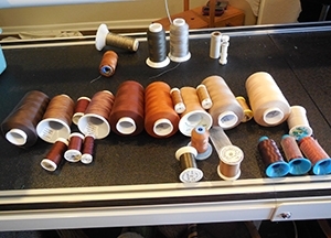
Shiny and dull threads for this horse

Shiny and dull threads for this horse

This week, let’s focus on the stitching of the first horse.

I selected a variety of threads in the full value range.  This first horse is pretty dark, and if I think about what the horse would look like in real life, my thread choices would fall in the medium to dark range.  My analytical brain has to take over to pick the very lightest threads.  Because this horse is standing in water,  a selection of threads with dull and shiny finishes were chosen to differentiate between the wet and dry parts of the horse.

Often, stitching begins with the lightest threads, working toward the dark areas, but this time, I did the opposite. I can’t say why with certainty.  Perhaps it’s because the dark threads will complete most of the stitching and the lighter threads will add the finishing touches.  The first step is to make some broad, sweeping stitch lines to hold things in place.  That is followed by several passes, filling in more and more each time.
These photos show how the work progressed.

Stitching horse 0

Stitching horse 1

Stitching horse 2

stitching horse 3

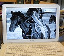
While working up close, it’s hard to fully appreciate what is happening.  I have to rely on

Reference photo on the computer

Reference photo on the computer

what I know should work as I’m stitching.  I also keep my laptop near by with a reference photo on display.  It is always such a treat to step back and look at the work and be able to appreciate that it has come together as planned.  Sometimes, it’s even better, like the stitching along the neck of this horse.  That’s when I smile, pat myself on the back, and say, “Lea, you’ve done well.  You should have some chocolate.”

After a cup of tea and a few Thin Mint cookies, I had to admit that I was not thrilled with the nose.  More on that next week…

Share

The Tangled Web

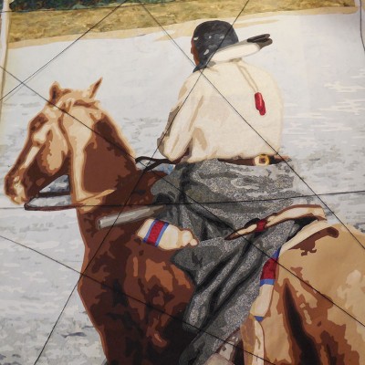
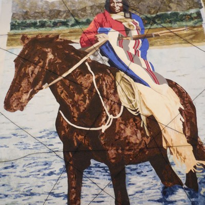
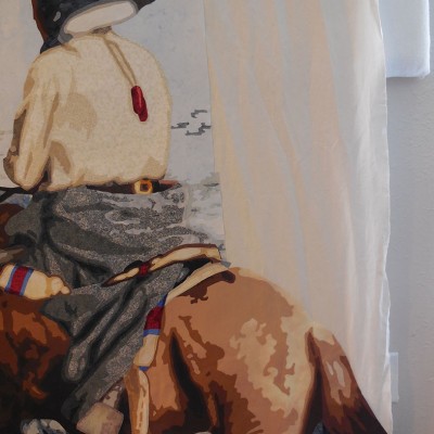
I’ve managed to get the first two panels of my 4 Horsemen triptych fused together and have come to terms with the reality that I will not get the 3rd panel finished in time for my May deadline. I will make the 3rd panel—someday—maybe in the summer.

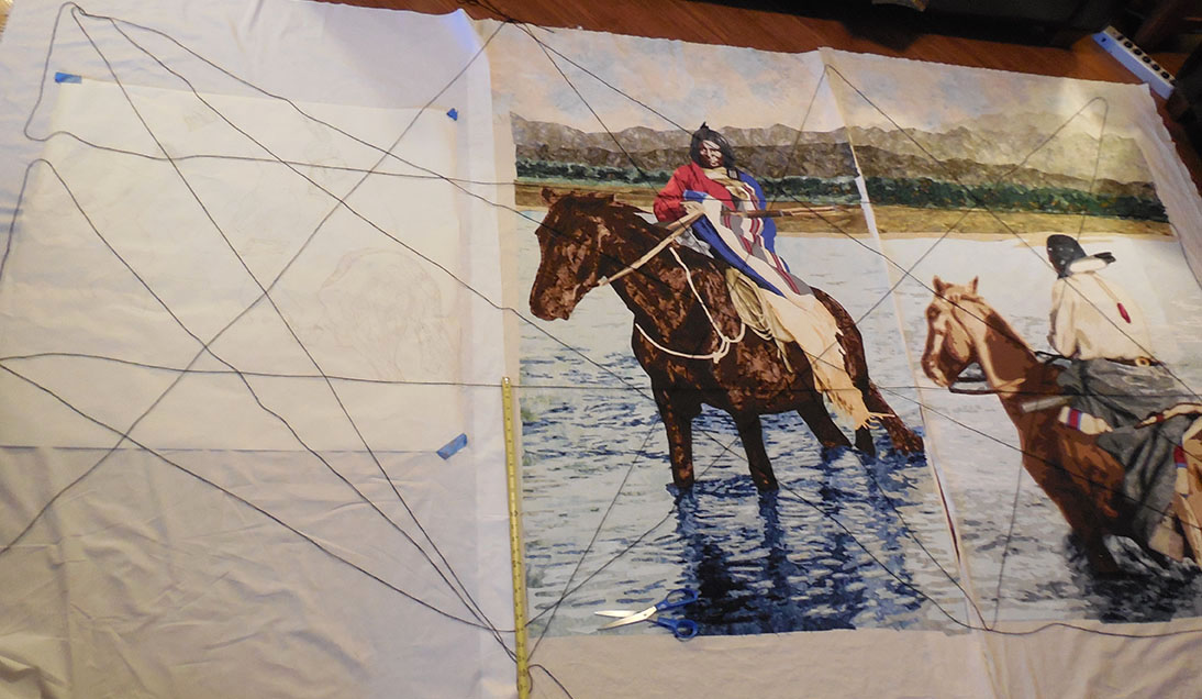
Before I can begin stitching, I must to do some planning and prep work now if the three panels are to fit together later. Toward that end, iI want to make sure that each panel works individually AND in concert with each other.

Panels side by side

Panels side by side

Here is the process:

  1. Lay the panels side by side. (Panel 3 is just a large sheet of muslin)
  1. Mark the corner points and 1/3 marks along each side.
  1. Run a line of string string between each of these key points.

In doing this, I can accurately place lines of the riverbank, foothills, mountains, and place the final riders in just the right position. Additionally, this web of string creates a grid for identifying key lines and points of intersection within the piece.

Here is my dilemma: the whole thing is way to large to fit on my design wall. The best I can do is clear the floor in my family room and lay out the panels. Unable to pin into the hardwood floors, I’m left to lay the string on the floor and they won’t stay put.  They are continually shifting as I move things around under them.  Eventually, I do get a sense of how things are laying out.

I see some good things going on in the right panel:

Lines o the right panel

Lines o the right panel

  • A diagonal goes down the face, hits the shoulder, belt buckle, then follows the line of the tail
  • Another diagonal follows the line of the neck, a crease in the blanket, and the shadow of the back haunch.
  • The lower horizontal connects the reins, rifle, and blanket fold


In the center panel:

Lines on the center panel

Lines on the center panel

  • A diagonal connects the hand, a stripe of the blanket, a line of rope, and then runs down the back leg
  • Another connects the eyes, bottom of the rope and follows the tail.
  • The lower horizontal runs along the belly of the horse


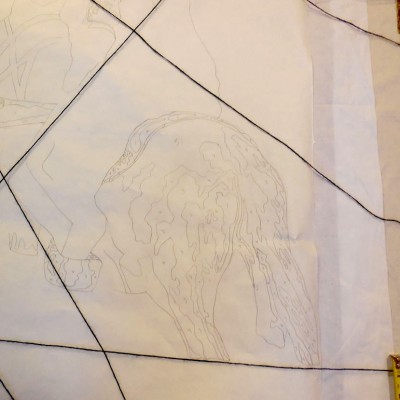
In the left panel:

Lines on the left panel

Lines on the left panel

  • I place the horses in the center between the horizontal strings
  • Diagonals from the upper left corner will fall along the head and back of the horse and also connect the nose, chest and stirrup.
  • I also sketch in lines for the background so that it will all come together in the end.


Doing this on the floor stinks! Every time I move something, I have to reposition the strings.   To make things worse, my trusty companion, Coco, has her own ideas about the placement of these strings.   I love her, but I REALLY don’t appreciate her design sensibilities.

Coco tries to help

Coco tries to help

Share

Does This Butt Look Big??

Too much off the edge

Too much off the edge

While fussing over the second horseman and I find a couple of problems with the composition.  I’m irritated by the horse’s back end hanging off the right side of the composition.  It seems to be too much.

Because I have already finished the background, extending it could be a problem.  Can it be done without creating a distinct line down the panel that is obvious and distracting??


horse butt after

Extending the water

I’ve got to try.  At this point, I think the key to the expansion project is to break up the vertical line.  As I add to each component of the background, I’ve got to stagger the additions of fabric.  The water is the largest area and most obvious, but I can camouflage that line with ripples.  Here is what I have at the end.  Let’s hope stitching hides the rest.

Try to ignore those black lines on the second photo.  I’ll explain them another day.

Share

Just the Right Face

Too much shadow.

Too much shadow.

The second figure has come together, but I don’t like the face.  Even though it is turned away from the viewer, it is still important to get it right.


Hair and face distinguished.

Hair and face distinguished.

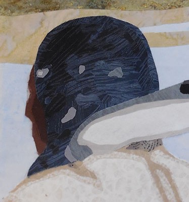
First, I don’t like that the head is a solid black shape as it creates too much shadow.  Replacing part of that black shape with brown helps to distinguish the hair from the face.


reference tools

reference tools

With that done, my attention now turns to the line of the profile. To make it accurate I  refer back to a drawing I did for my book showing the correct placement of features.  I hang it next to my fused image. BONUS: the drawing happens to be almost the same size as face of my rider.  Using a ruler I hang in front of the fused face, I place pins to mark important benchmarks: top and bottom of the head, bridge of the nose, bottom of the nose.


From there, I make some nips and tucks and put the best face forward.

Now its right!

Now its right!

Share

The 2nd Horseman

The horse's patooty is coming off the edge.

The horse’s patooty is coming off the edge.


I’m back at work on the second panel of the 4 Horsemen.  The first dilemma is getting the scale correct. This figure, originally, behind the central figure, will now be in from of him, so he’s got to appear larger. It took some trial and error, but I finally got the size right.  I like an irregular edge, so I’m going to hang the horse’s patooty off the edge.


Continuous background

Continuous background

The key with this composition is to keep some key elements consistent across both panels.  In this case, it is the lines of the background.  As they continue from one panel to the other, they create a cohesive composition. I’m loving this.


Willis to the rescue.

Willis to the rescue.


I’m nervous about the pace of my work being slow, and am considering reducing the scope of this piece to 2, rather than 3 panels.  I really love the title and “The 2 Horsemen” doesn’t have the same appeal. So, when my parents stopped in to visit on their way to ski country,  I put my dad to work in the studio fixing the rollers on one of my chairs.

Share

Blanket Statement

These last couple of weeks, I’ve frantically been working to complete the fusing portion of the center horseman panel before other, looming responsibilities interrupt me.  The body of the rider has taken a lot of energy.  There were many tiny pieces and a lot of confusion in sorting out what was what in the photo, but I finally put him together.

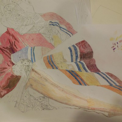
The big design decision here was the color scheme for the blanket.  The overall scheme for the piece is a double compliment: red-green, blue-orange.  Currently, a very dark orange is brought into the composition through the horse. I really wanted to work in some lighter warm orange in the blanket, but couldn’t visualize it.  Several photocopies of the pattern were made and filled in with colored pencils.  In the end, it was a red, white, blue, and gray scheme that worked with the rest of the composition. See the progress below.

A portion of the original photo

A portion of the original photo

Audition colors on paper. Orange isn't working

Audition colors on paper. Orange isn’t working

Blanket in progress in red, white, blue--and grey.

Blanket in progress in red, white, blue–and grey.

Finished rider.

Finished rider.

I’ll tell you about the background in a future blog.

Share

I’m Making Water

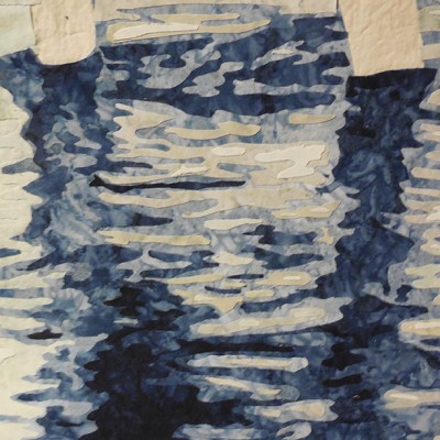
Finally, it’s time put start fusing fabric.  For my next piece, The Four Horsemen”, I’m starting at the bottom and working my way up.  That means creating the river that the horsemen are crossing.  Hand-dyed fabrics in cool blue and a slightly warmer blue-green are chosen.

water1Looking at the pattern, I see that there is a lot of value change and small pieces needed to get the effect of flowing, swirling water.  After studying the pattern, the best course of action seems to be to establish some larger value areas with big pieces of fabric and then apply smaller lighter and darker pieces over the top.Water 2


The process involves lots of tedious cutting, with sharp curves.  However, it worth it when I step back and can see the pattern of the ripples change as the water flows around the horses legs.  I’m pleased with the contrast of light-dark, and warm-cool.  It’s a good start.water-full


Share