Unity & Variety are tools to create harmony and interest in art quilt compositions, and were the elements of composition that we explored in the last session of my monthly COLOR & COMPOSITION class. In this blog I’m sharing some of the highlights of that discussion.
UNITY refers to a relationship between the elements within a composition that bring harmony. The desired effect is to create the feeling that a work is a single creation with multiple parts, as opposed to, a collection of separate things.

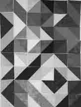
Composition with unity

Composition with disunity
Techniques to Create Unity.
A number of techniques can be used to create unity.
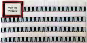
Visual Repetition
Visual repetition is probably the most common way of creating unity. Repetition gives a

Analogous scheme with blue & yellow parents.
sense of familiarity. As humans, we prefer familiarity over anomaly. This can play out in various ways:
Color Scheme– Choosing a scheme brings focus and consistency. Each color is a part of a larger structure.
Line-Repetition of lines is more than having multiple lines. It is also about repeating the same kind of line, such diagonal, horizontal, s-curve, or spiral.
Shape: Shapes can be geometric or organic. They can vary in size, or color. In eluding multiple versions of the shape creates familiarity and harmony.
Proximity
Placing items near each other creates unity through grouping. This is where negative space is important. If you are going to create a space for items to gather, there also has to be a place where they do not gather. This “negative space” will be a topic in our next Color & Composition session.

Turkish Treasures Still Life, 2020.
This still life composition was created for an article I wrote for Quilting Arts Magazine (April/May 2020). It illustrates the concept of proximity. I communicate that these objects go together by placing them in contact with each other, or overlapping them.
Simplicity
Eliminate unnecessary elements in a composition so that the focus can be on what is important. Too many different things competing with each other creates confusion and discomfort.
When I teach my portrait class, students work from a photo. One of the first things I talk about is cropping out anything that is in the background that has nothing to do with the subject. If it can’t be cropped, then distort, blur, or replace it. This is what I did in Sweet Song From and Old Fiddle.

Detail of Sweet Song From and Old Fiddle, 34″ x 18″, 2013.
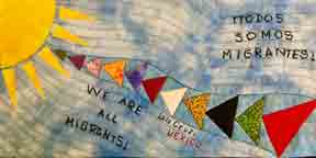
Thematic Relationship
You may have objects that don’t share other unifying qualities, but they share an underlying meaning. A good analogy is the sewing machine: it is made of many different parts, but, put it all together and it it works. Remove a piece, and it doesn’t.
I remember a news report on January 20, Inauguration Day that featured Donald Trump speaking at Andrews Joint Base in front of 17 American flags. Apparently, the number 17 was important because Q is the 17th letter of the alphabet, and Q-Anon supporters believed this was a symbol of the revolution to come later in the day.
Consider those elements: American Flags, Letter Q, # 17, Revolution.
Regardless of your political leanings, that those elements were thematically connected, is astounding.—Scary as hell, yet, astounding.
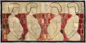
The example I have to share with you is much more benign. I give you Busy Signal where a cell phone, a hand with wait gesture, and a face cut off below the eyes send a message about communication and connection in our world.
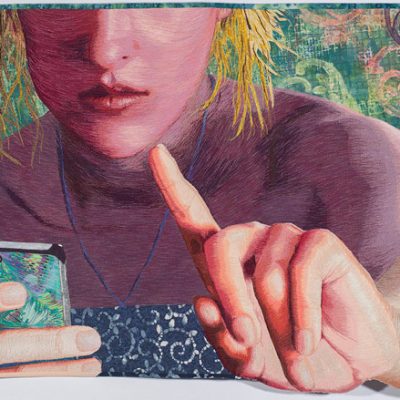
Busy Signal, 25 in x 36, 2017.
Add Variety to Create Interest
Variety-of elements creates interest, breaks the boredom, and adds interest. Again, there are various ways to do this.
Altered Repetition
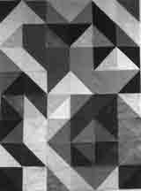
Incorporate an anomaly, a change in the repetition. In the Circles in Squares example below, all of the elements share a color scheme, and the sizes and shapes are consistent, but offsetting, or slight shifting of elements adds interest.

Circles-in-Squares color study
Interrupt the Pattern
Another option is break a pattern my inserting a another element. I did this in my tribute to Malala, by placing her image over a large floral border.

Malala, by Lea McComas, 30″ x 50″, 2019.
Color & Composition Monthly Workshop
Interested in learning more? Every month I lead a Color and Composition class where we explore a color scheme, color concept, and a composition concept. We meet online the 4th Saturday of every month 1:00-3:00 PM MDT. To join us, sign up through the Rocky Mountain Quilt Museum.
Subscribe to this blog for future updates on topics covered in the Color & Composition class.


 Analogous color schemes include a run of colors next to each other on the color wheel. These schemes can include 3, 5 or 7 colors. They work best when built around primary colors. Like a monochromatic scheme, analogous schemes are great for conveying strong emotion. They also have


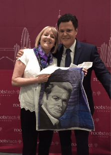

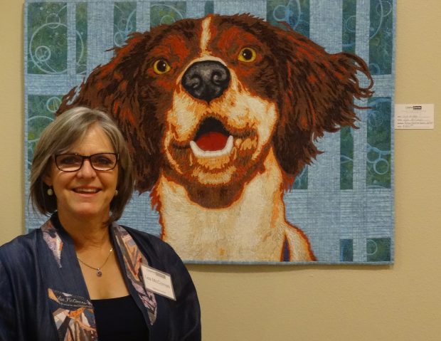
 Other participants were working on portraits of dogs, grandchildren, husbands, children friends etc. I had chosen to work on a portrait of my long-time idol – Donny Osmond (Husband and Dog assured me that they were not jealous at all)