Golden Mean Calipers
Today, I want to share with you a tool that I’ve discovered called the Golden Mean Calipers.. I’ve also seen them labeled “Fibonacci Gauge.” can be a useful design tool in your artistic process. There are a variety of ways this particular tool can be used. Let me illustrate a few.
Finding the Sweet Spot Within Your Composition
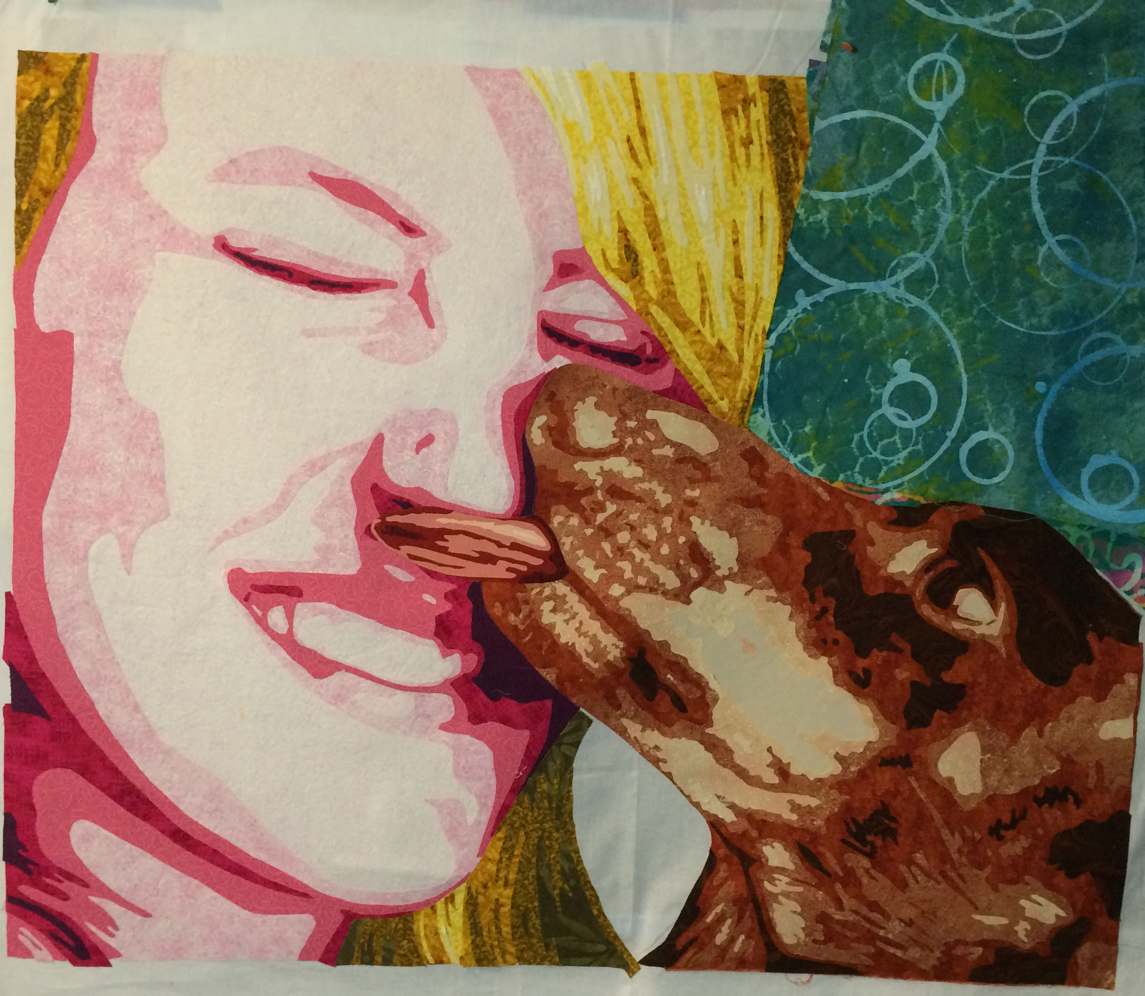
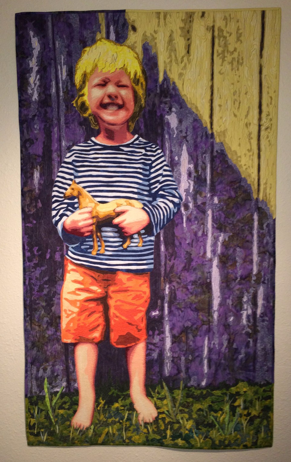
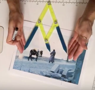
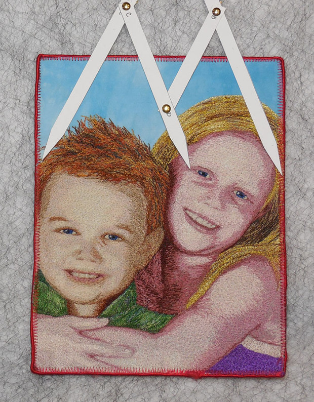
A focal point is used to grab the viewer’s eye and engage the viewer in your artwork. Generally, it is best to avoid taking the viewer’s eye to the center, for when it arrives there, it will tend to stop and rest. Placing key elements off center will tend to prolong the viewer’s engagement with the composition. Use the calipers as shown below to determine the best placement of the focal point and other key elements of a composition. In portraits, eyes and mouths are important features for focal points.
Use calipers for cropping the sides of an image.

Lay the calipers over a photo print, to determine the best way to crop it.

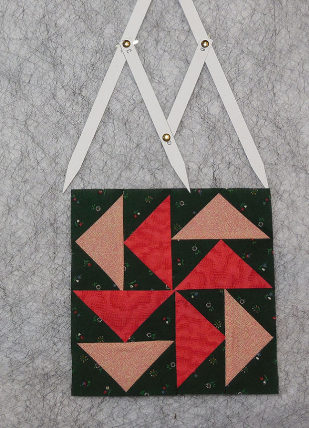
Use the calipers to determine the placement of a design element within a larger panel.
Taking Elements Off the Edge
Avoiding the middle also applies when taking lines or elements off the edge of a composition. See how the calipers can be used to determine the most visually pleasing locations for the placement of lines that will carry the viewer’s eye to the edge of a composition.


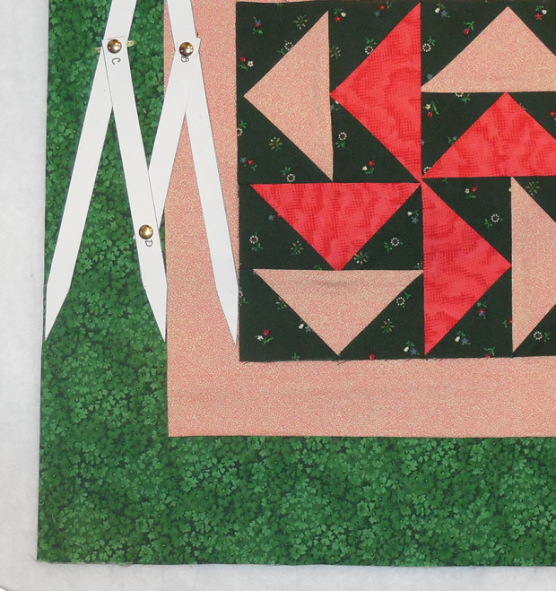
Creating Borders with Harmony
This tool is also useful when adding borders to a traditional block quilt. One method is to start with the blocks themselves. Place the outer points of the calipers at the edges of the blocks. This will give you two new measurements that will be in harmony with the blocks. Use the larger measurement for the total width of the border. This area can further be divided by placing the outer points of the calipers on the edges of the border area. This will indicate pleasing widths for and inner and outer border. All measurements indicate finished sizes. Don’t forget to add seam allowances.
Measure the width of your block.

Create a single border matching the wider measurement of the calipers.
Create harmonious smaller borders.

Divide the border area using the calipers.
Sometimes, a specific finished size is necessary and this isn’t achieved in the process above. In this case, determine the desired total width of your outer borders, open the calipers to this desired width and then measure the distance between the points to determine the finished widths of an inner border and outer border.
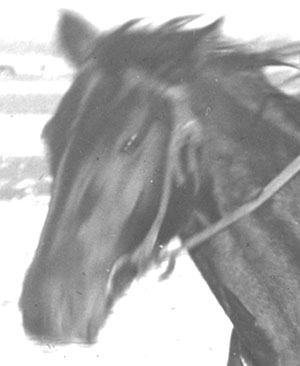
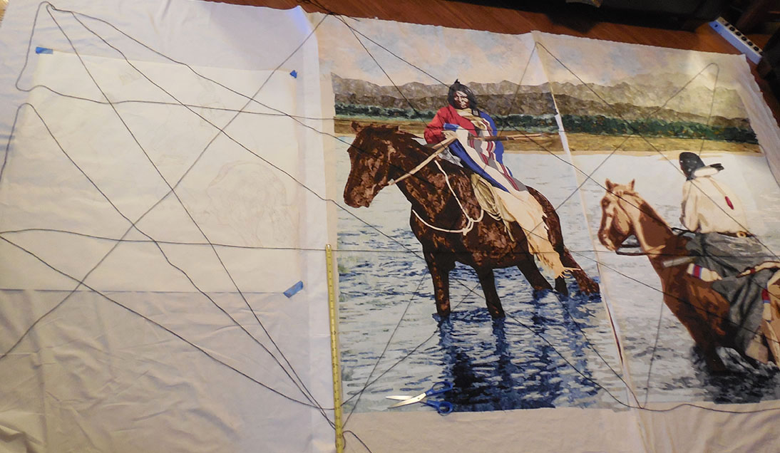
Perfect Facial Proportions.
The Golden Ratio occurs naturally within faces and calipers are useful when creating portrait works, either when drawing the face, or problem solving when a face doesn’t look quite right. See the photos below for ways to check the proportions of the face, and placement of the features.
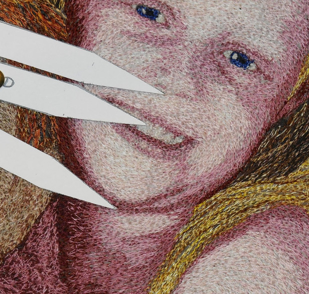
Placement of mouth between nose and chin

Bring of the nose in relation to forehead and chin.

Placement of eyes
If you are interested in learning more about facial proportions and portrait quilting, check out my book, Thread-Painted Portraits: Turn Your Photos into Fiber Art
AND look for videos on my YouTube Channel Lea McComas Fiber Art.